

Here is the logo for the project. The brand owner, Martha, envisioned a design that is simple, minimalist, and luxurious. After considering several options, she ultimately chose this one, which I am presenting in a variety of colors.
The name "Isariel" itself is a fusion of two powerful symbols: Isis, the Egyptian goddess of magic and beauty, and Ariel, which translates to "lion of God" in Hebrew, a symbolic name for Jerusalem in Jewish tradition. This blend reflects strength, divinity, and timeless beauty, all core values of the brand.

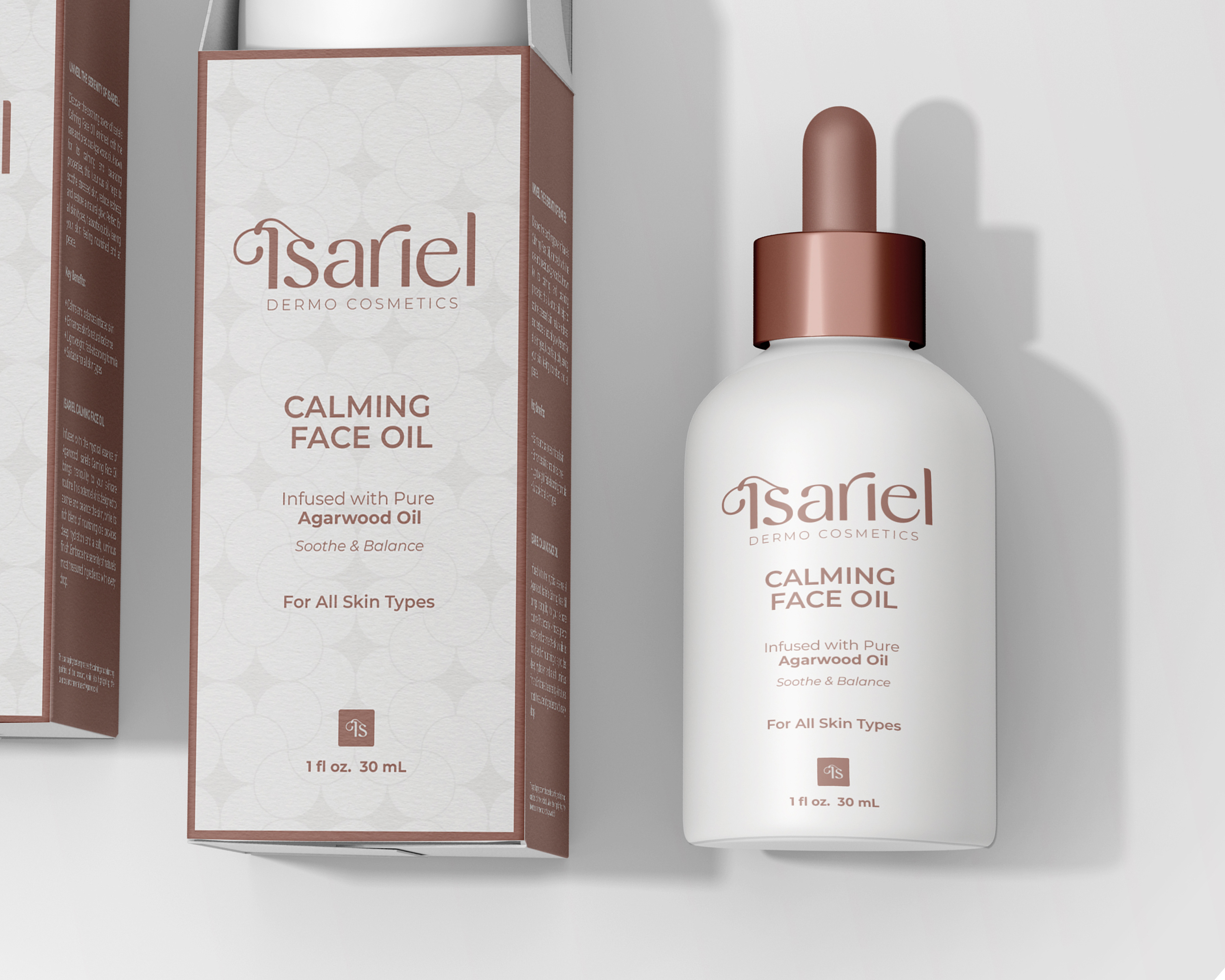
In the upcoming section, I will showcase the product visuals that I have meticulously designed. These images highlight the details and aesthetics of each product, demonstrating the creative process and design elements involved in bringing the project to life.
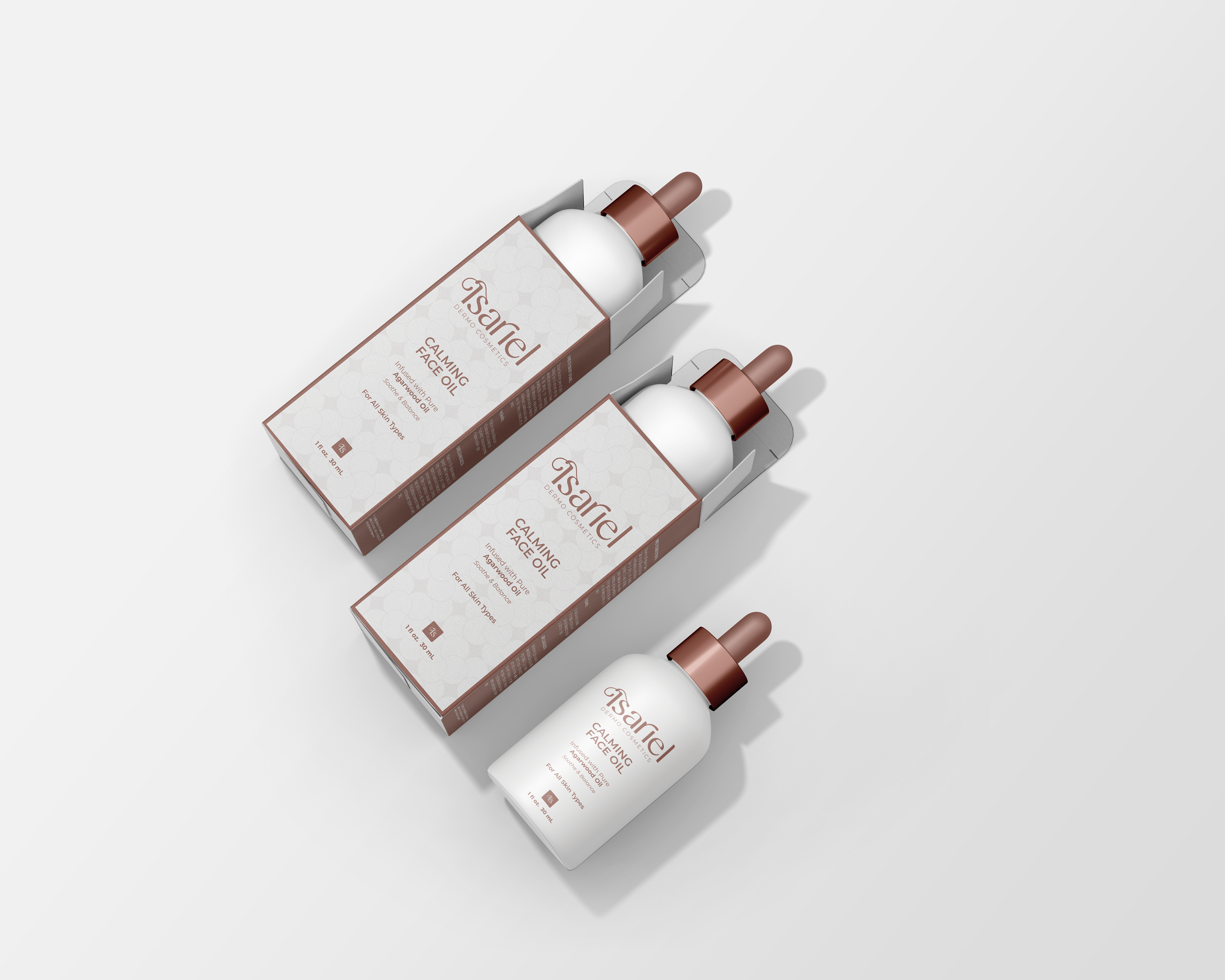
The calming face oil from Isariel Cosmetics is designed to soothe and nourish the skin, reflecting the essence of nature in both its formula and packaging. The warm shade of brown chosen for the product symbolizes the connection to the earth, representing beauty rooted in nature and tranquility.
The minimalist design of the packaging visually conveys the oil's calming and restorative properties, with clean lines and simplicity reflecting the purity and effectiveness of the product itself. This approach ensures that the design complements the product’s natural benefits while delivering a luxurious, elegant feel.
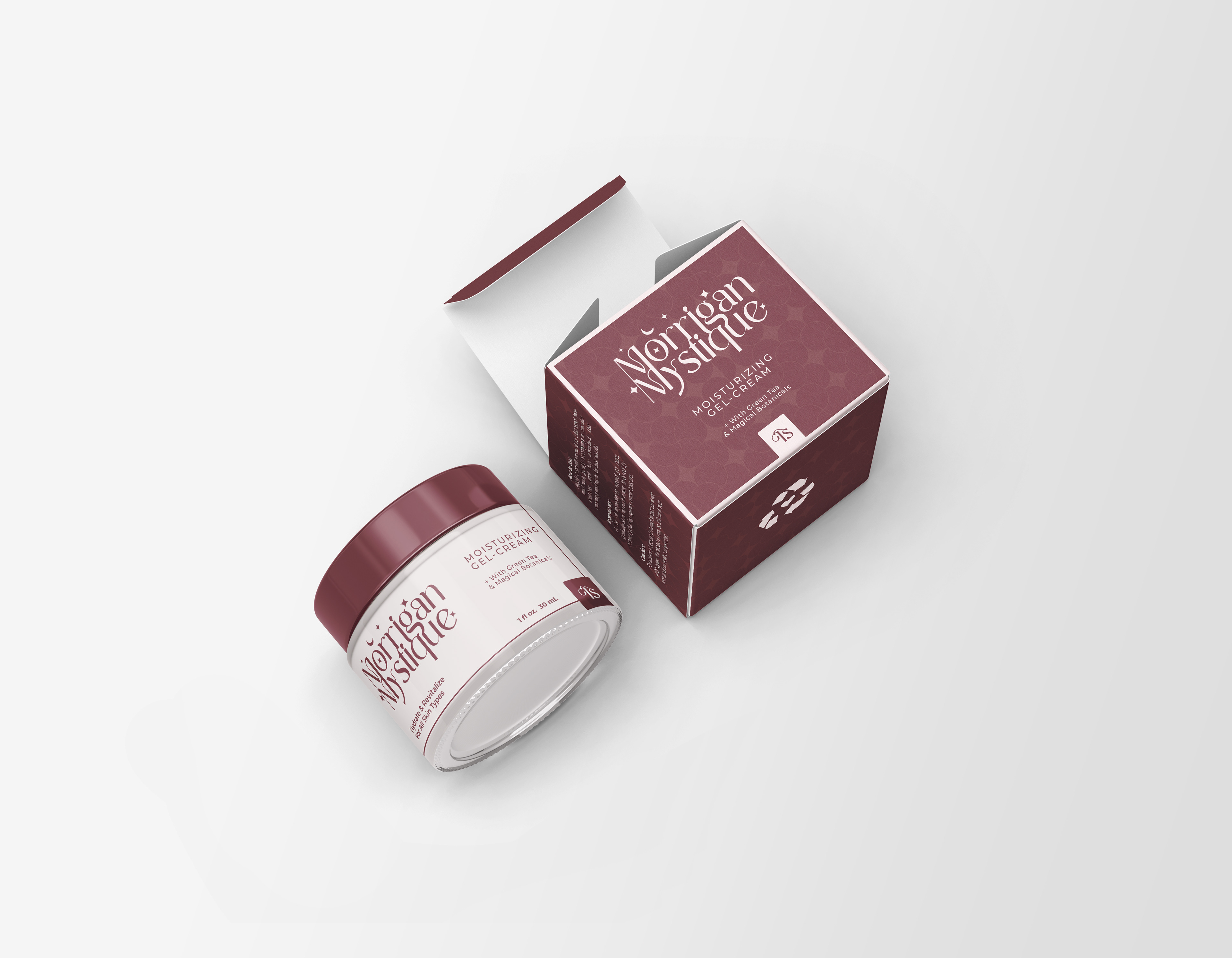
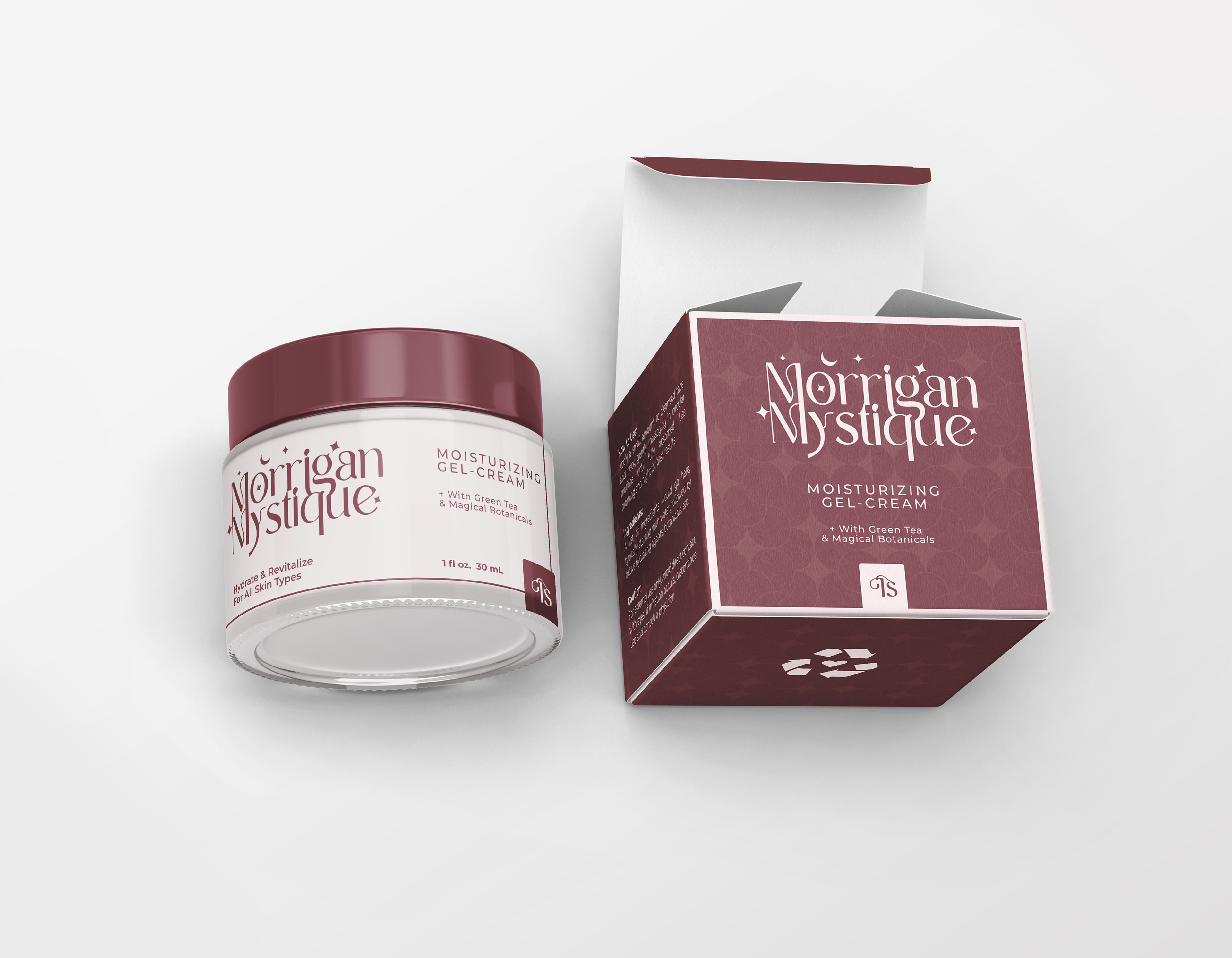
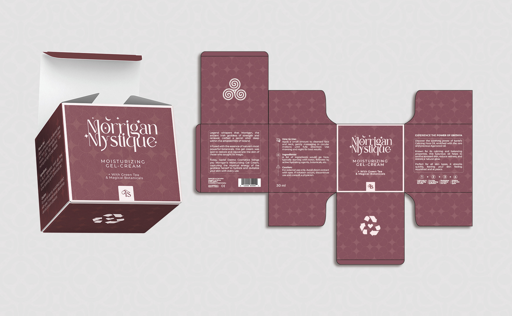
The chosen logo for Isariel Cosmetics reflects a deep connection to both elegance and mystique. The naming draws inspiration from the Irish goddess Morrigan, known as a powerful symbol of beauty, transformation, and strength. As a beauty emissary, Morrigan embodies the essence of empowerment, making her an ideal representation of the brand.
The use of the word "mystique" adds a layer of intrigue and sophistication, creating a contrast that elevates the brand’s identity. The design and color palette were carefully selected to instill a sense of trust and safety, ensuring that clients feel they are investing in the finest, most meticulously crafted cosmetic products available.
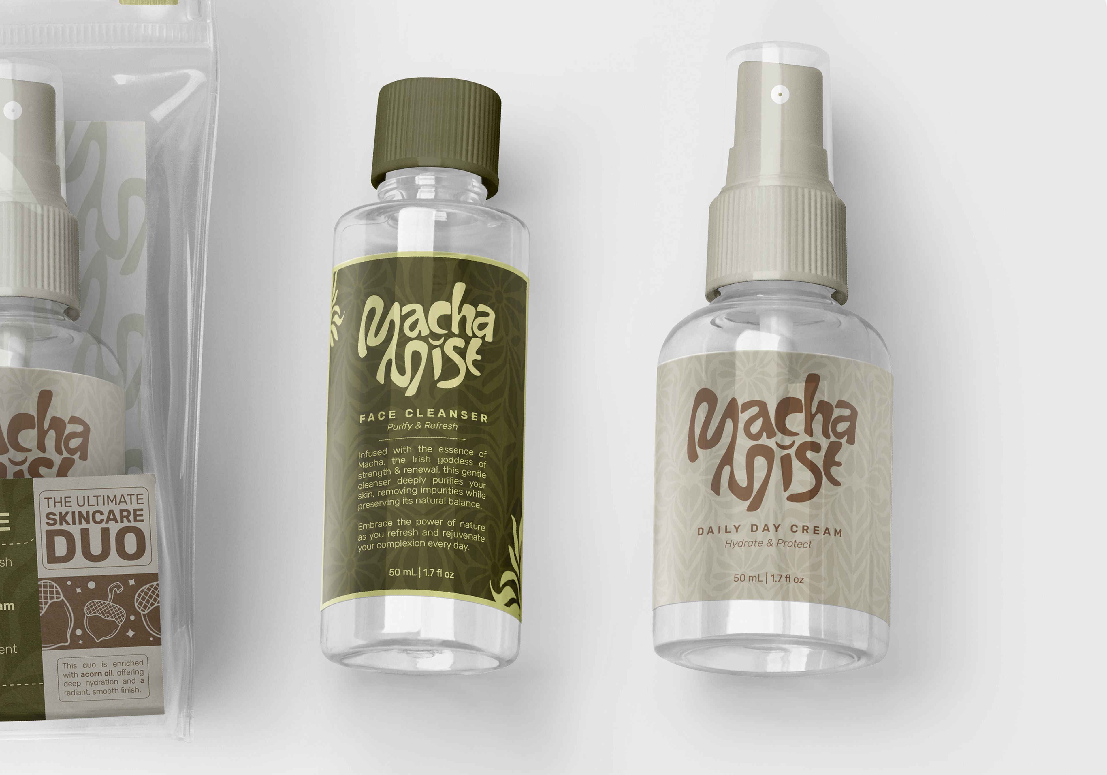
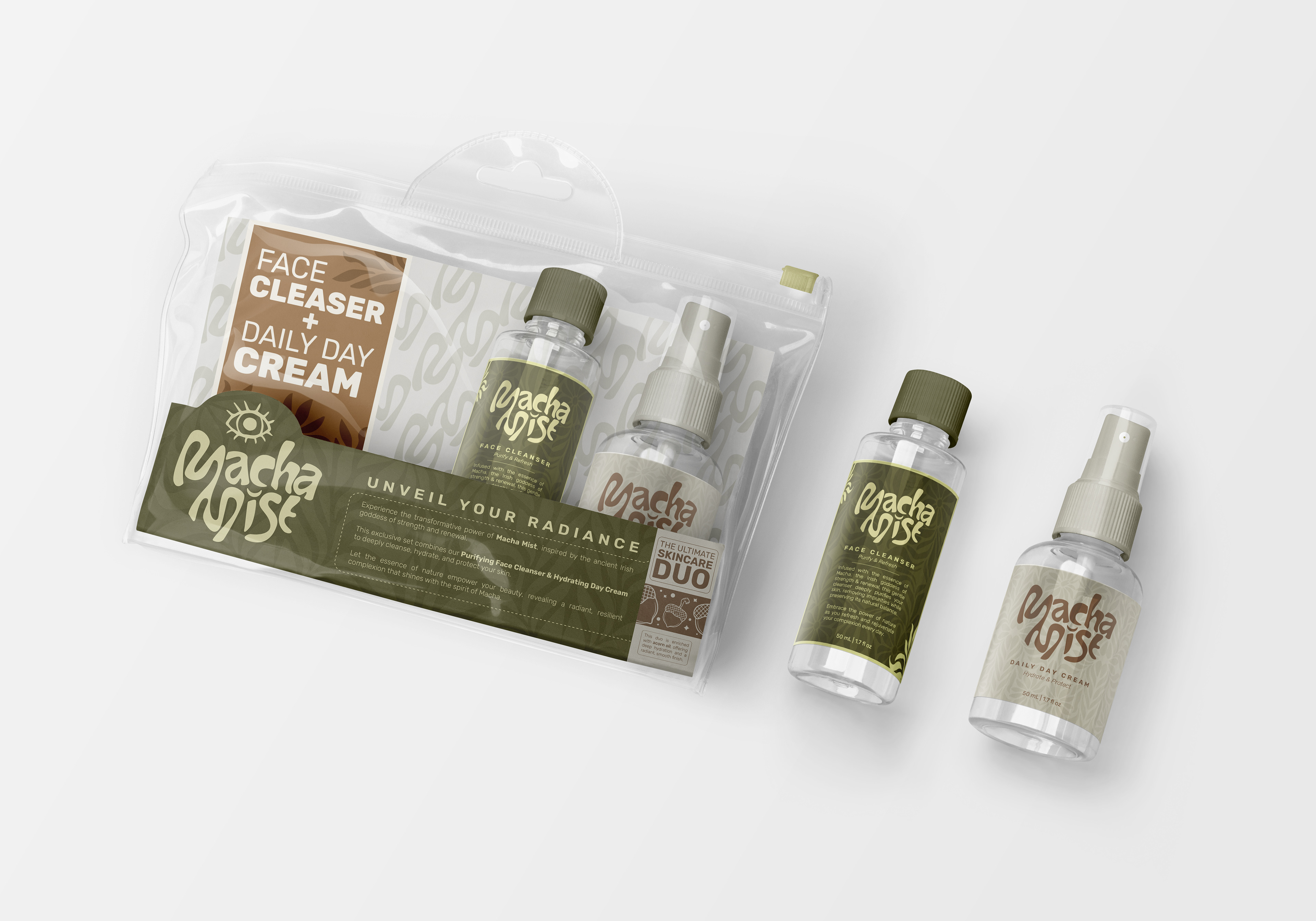
The selected logo is a distinctive embodiment of elegance and deep symbolism. Inspired by the Irish goddess Macha, known for her strength, beauty, and sovereignty, the logo positions her as an ideal emissary of beauty. Macha's association with femininity and power makes her a perfect symbol to represent our brand's commitment to empowering women. The incorporation of the word "mystique" adds an intriguing contrast, enhancing the allure and depth of the brand's identity.
The design, colors, and naming were meticulously crafted to make clients feel safe and confident that they are purchasing the finest and most precise cosmetic products. The duo pack features a 50ml face cleanser and a 50ml daily day cream, both enriched with acorn extract. The chosen color palette reflects the natural essence of the products, symbolizing the purity of oil, acorn, and other botanical wonders. These earthy tones emphasize the natural ingredients and the botanical magic infused in each product.
This logo differs from previous designs, showcasing the company's expansive spirit and its limitless commitment to noble and aesthetic excellence. The unique blend of ancient symbolism and modern design principles highlights our dedication to creating products that transcend traditional boundaries. Suitable for women of all ages, this product line bridges timeless beauty with contemporary elegance, allowing every woman to feel connected to something both ancestral and exquisitely refined.