ENG : Need an audio option? Press play to listen to the text while scrolling to view the visuals at the same time.
FR : Besoin d'une option audio ? Appuyez sur lecture pour écouter le texte et faites défiler pour découvrir les éléments visuels en même temps.
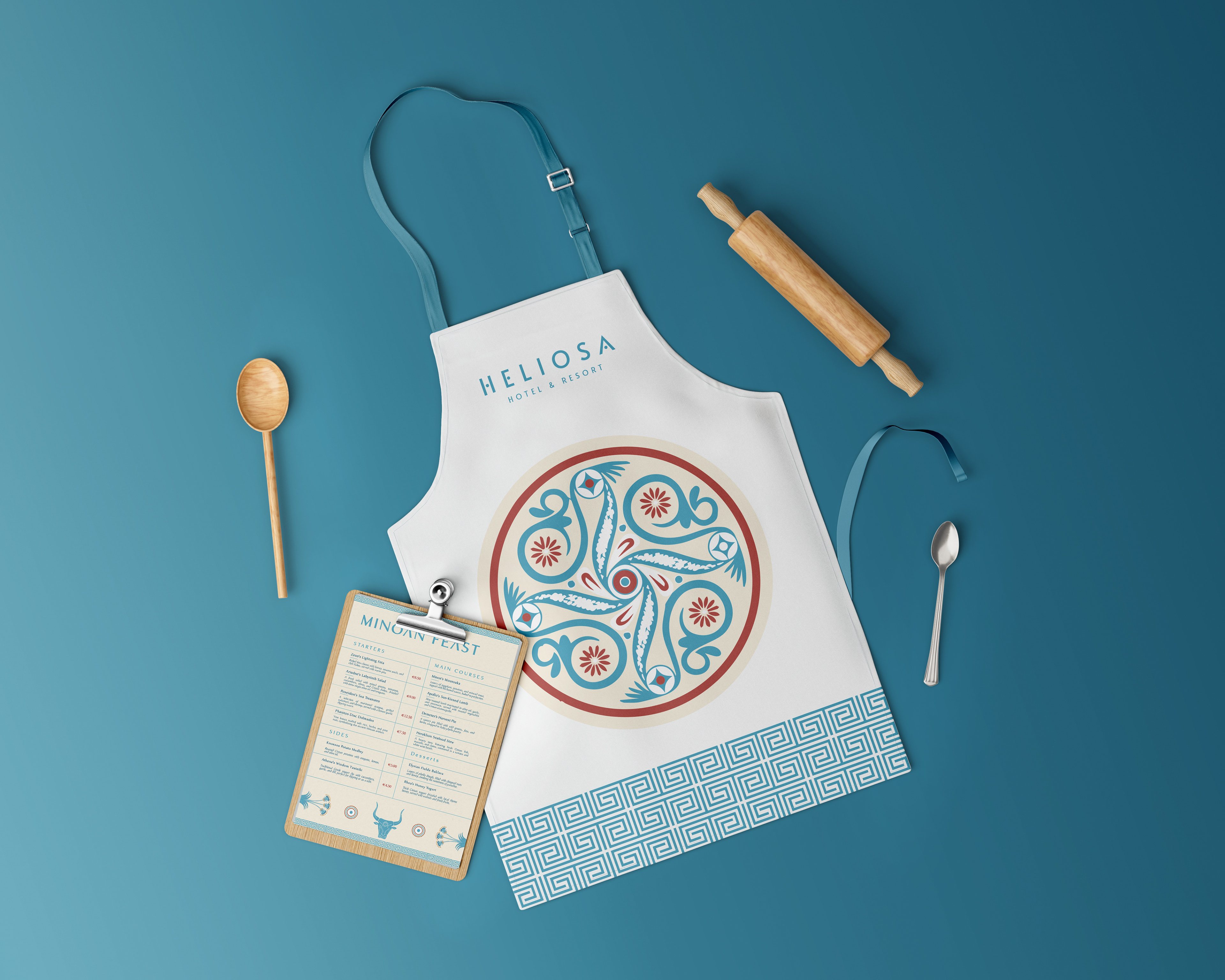
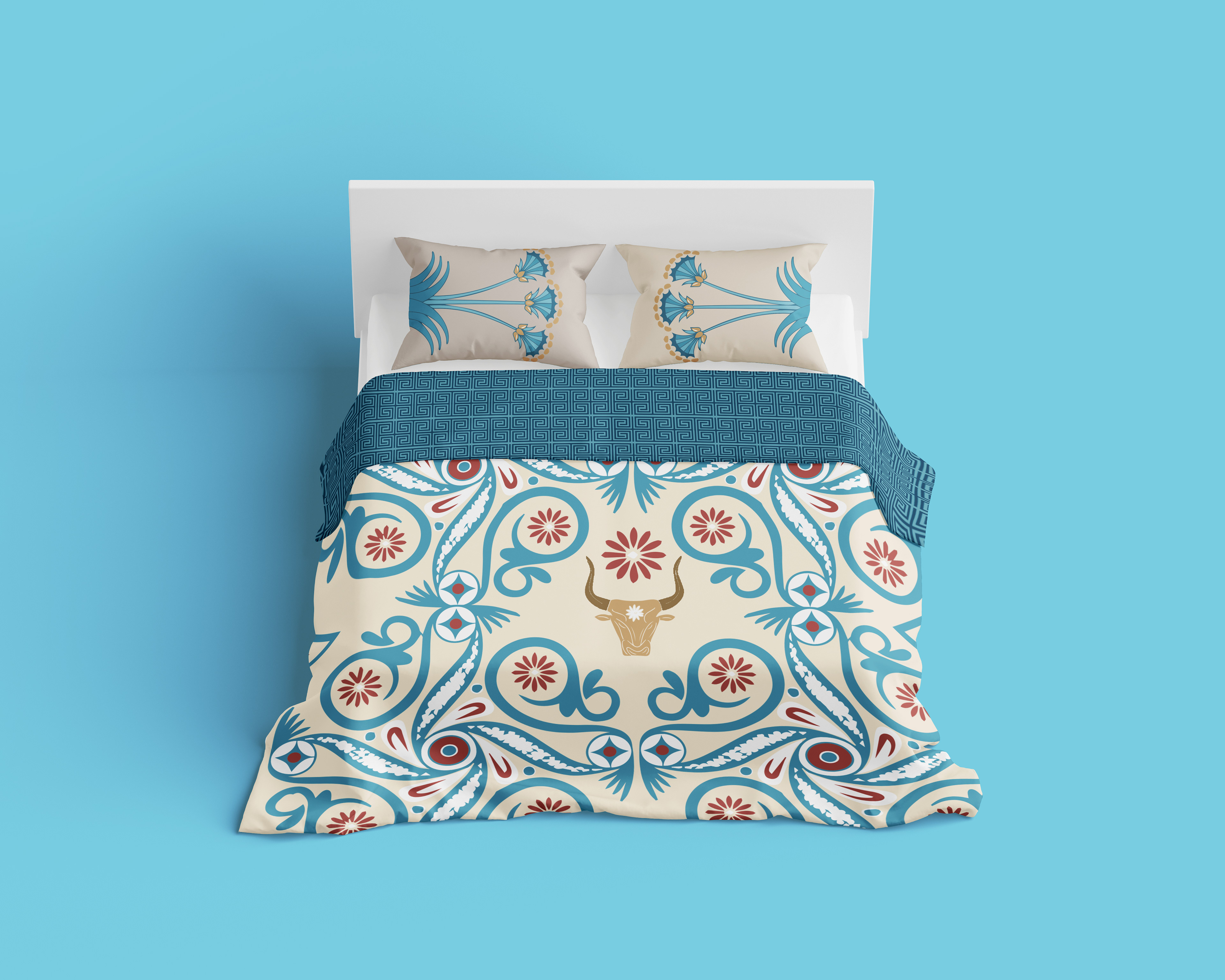
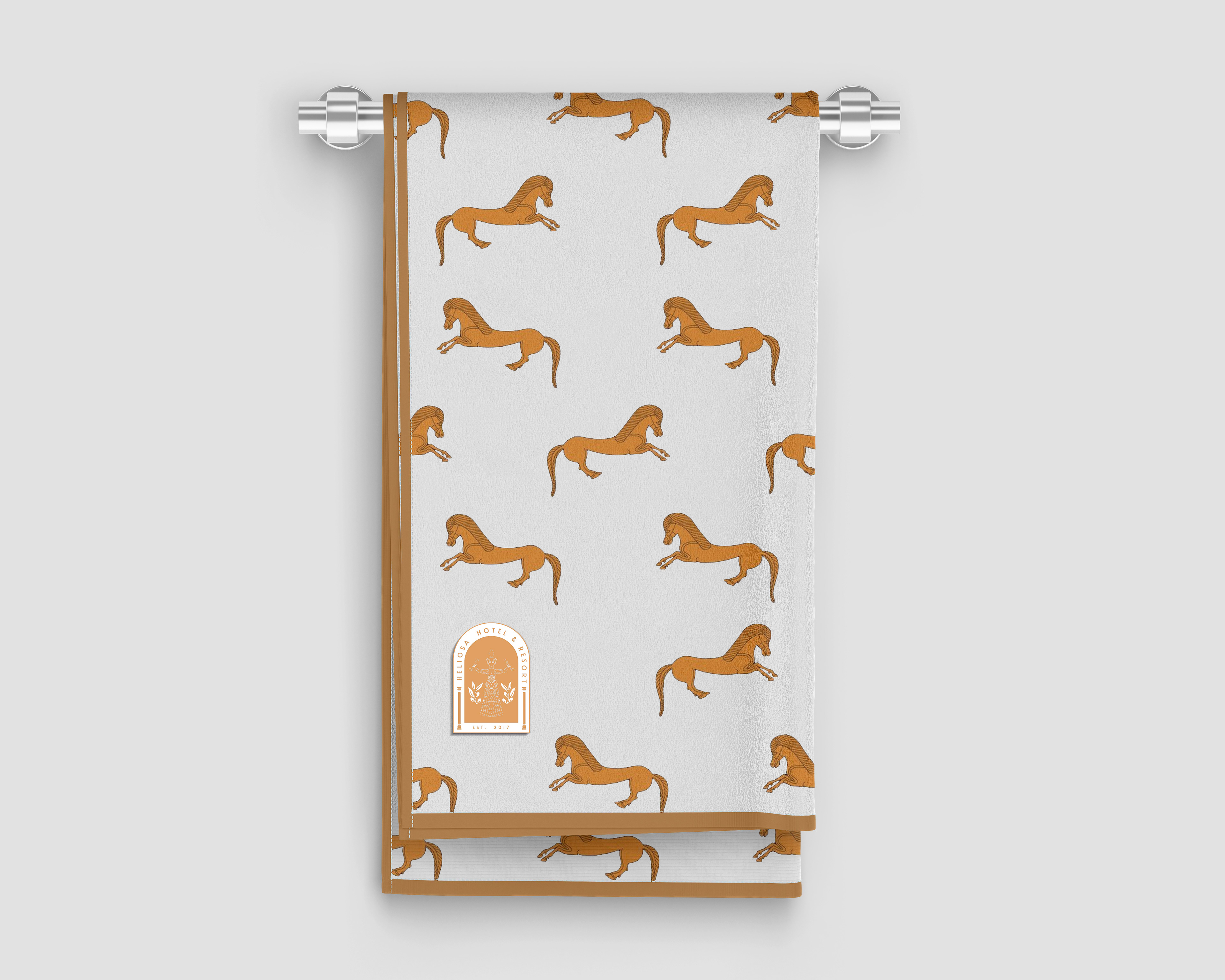
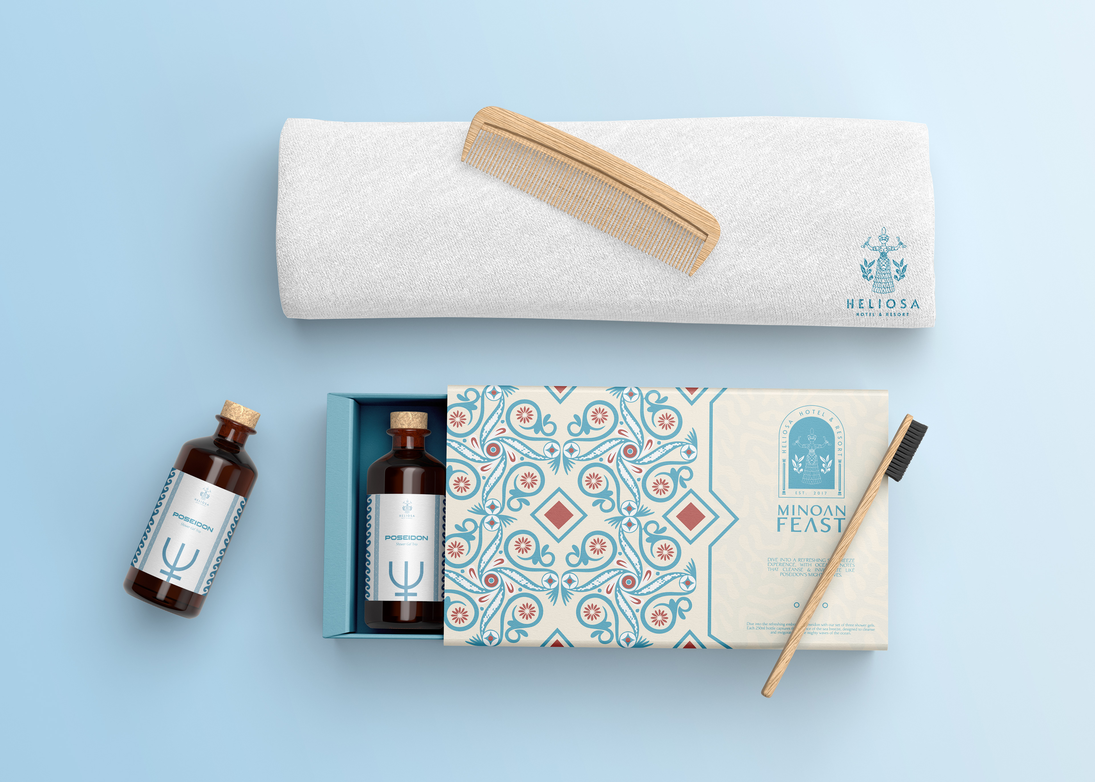
Heliosa, a luxurious Greek hotel nestled in Crete, draws its inspiration from the rich heritage of the ancient Minoan civilization. The hotel's design embraces the iconic archetype of the Snake Goddess, a powerful symbol of renewal, fertility, and protection in Minoan culture. The colors used throughout the hotel. Earthy tones, deep blues, Minoan crimson & warm golds, are an authentic reflection of this ancient civilization, evoking a sense of timeless beauty and connection to the past.
The vision behind Heliosa is to transport visitors back in time, offering an immersive experience where they can disconnect from the noise of modern life. Guests are invited to surrender to the tranquility, relaxation, and clarity that reign supreme, much like the mighty Zeus and Rhea in the pantheon of gods. At Heliosa, ancient history meets modern luxury, allowing every visitor to embark on a unique journey through time, where serenity and beauty intertwine seamlessly.
Logo Symbolism
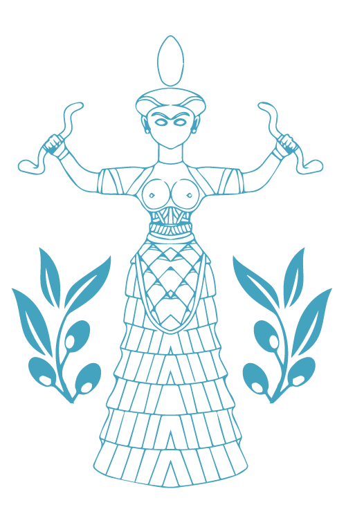
The Heliosa logo draws its symbolism from Crete's ancient Minoan Snake Goddess, embodying fertility, renewal, and protection. This figure represents the essence of timeless resilience and beauty, aligning with Heliosa's identity as a blend of cultural heritage and tranquility. The logo captures these qualities by incorporating shapes and forms inspired by Minoan art, suggesting a sense of sophistication and classical allure.
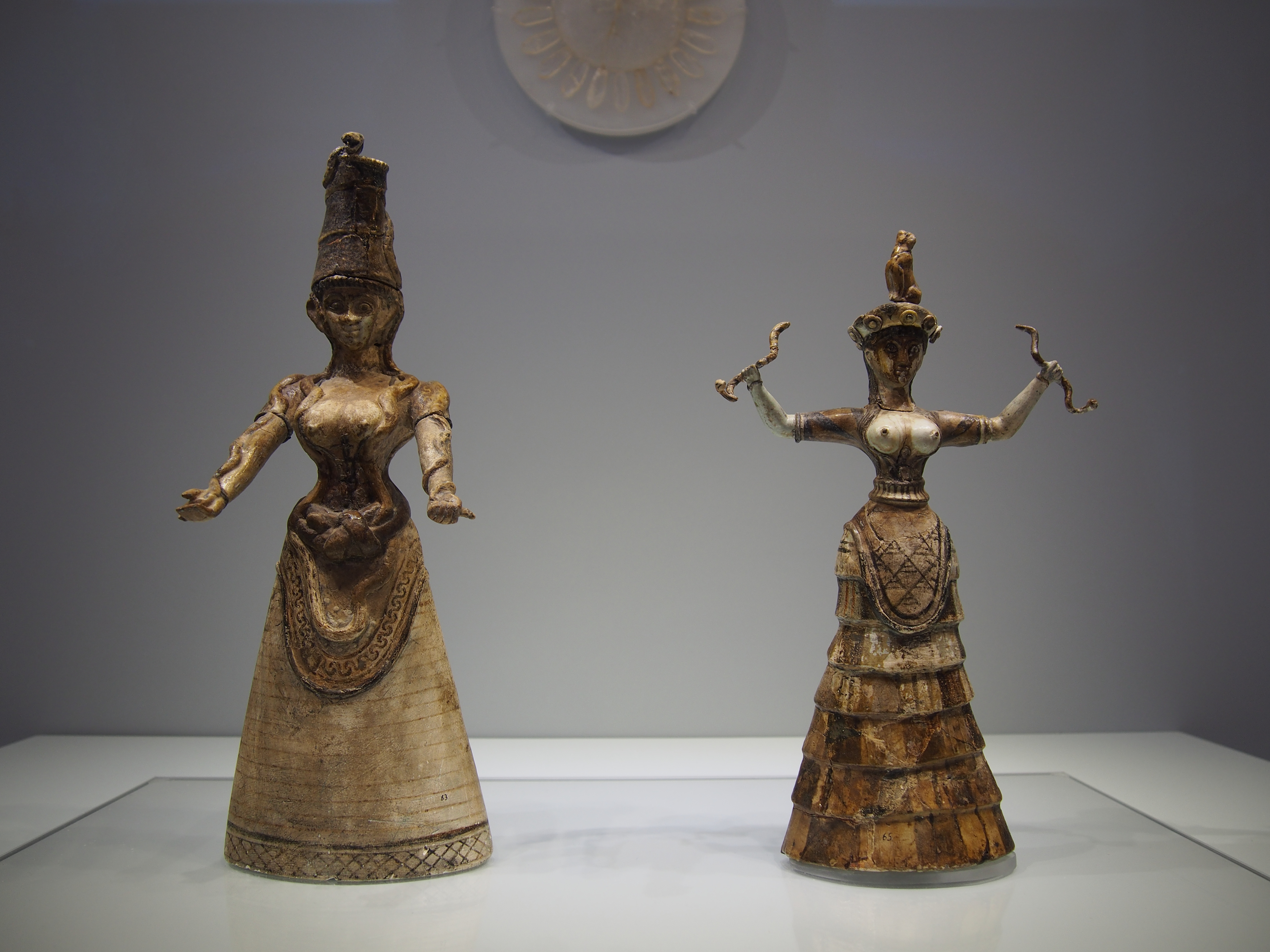
Minoan Snake Goddess figurines, c. 1600 BCE, Heraklion Archaeological Museum, Crete. (Wikipedia)
COLOR PALETTE
For colors, Heliosa uses blue to evoke the Mediterranean Sea's serenity and depth.

Sky Blue (#5AB1DD) : Represents openness, peace, and relaxation, inspired by clear skies and calm seas, invoking tranquility.
Teal Blue (#2D7A92) : A grounding, mid-tone blue symbolizing depth and balance, echoing Mediterranean waters and harmony.
Slate Blue (#426A90) : A muted, stable blue that brings a sense of sophistication and calm, suggesting a connection to historical elegance.
Minoan Red (#B64E3B) : A warm, terracotta red evoking vitality and life, linking to ancient Minoan heritage and Cretan landscapes.
Warm Gold (#D9A964) : Symbolizes luxury, warmth, and hospitality, evoking the sun and natural light.
Pale Sand (#D2D0C1) : A subtle, neutral shade that represents calm and grounding, reflecting the sandy landscapes of Crete.

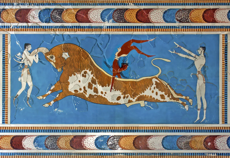
Late Minoan painting from Knossos, Crete, depicting young people vaulting over a bull, c. 1450–1400 BCE; in the Heraklion Archaeological Museum, Crete. (Britannica)
These earthy tones together create a sense of elegance and a connection to Crete’s natural landscape.
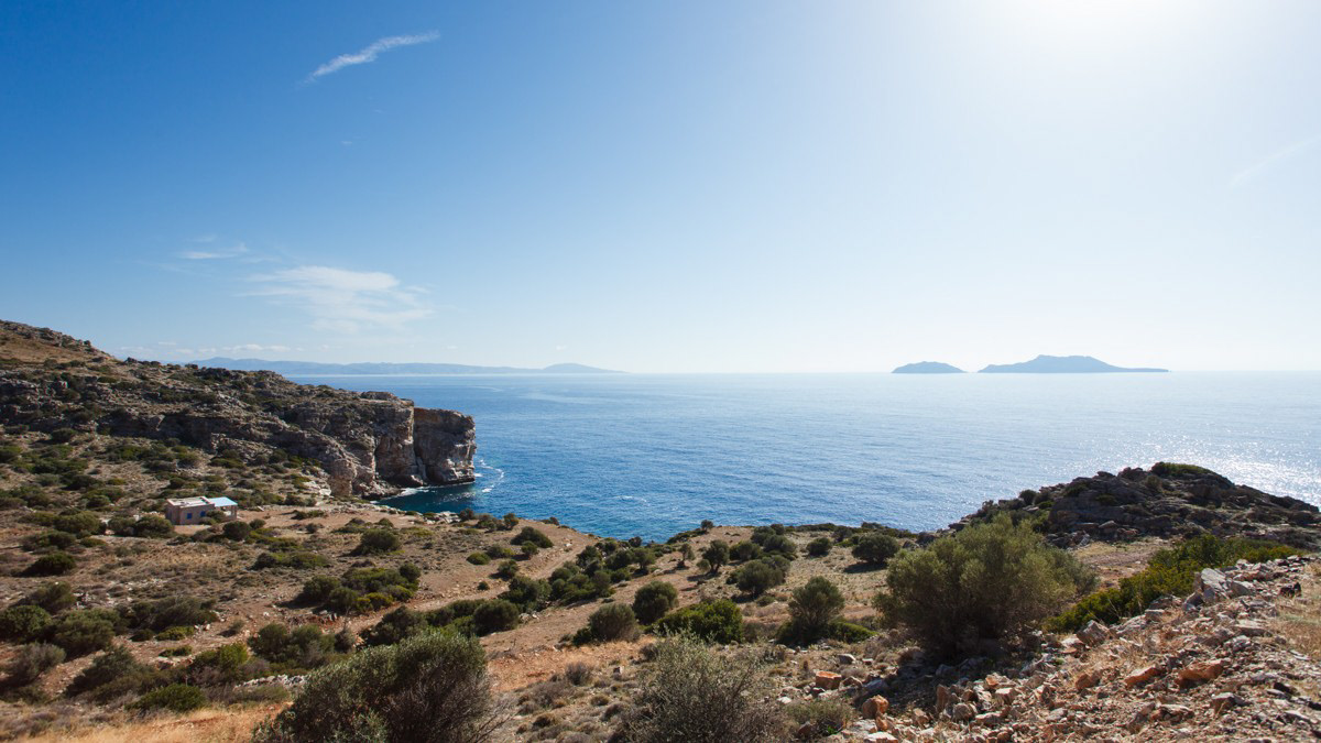
Unobstructed sea views from a serene plot along the rugged coast of Rethymnon, Crete.
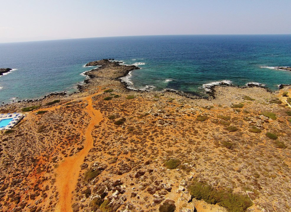
A seafront plot near Stavros Beach in Chania, offering breathtaking views of Crete’s turquoise waters.
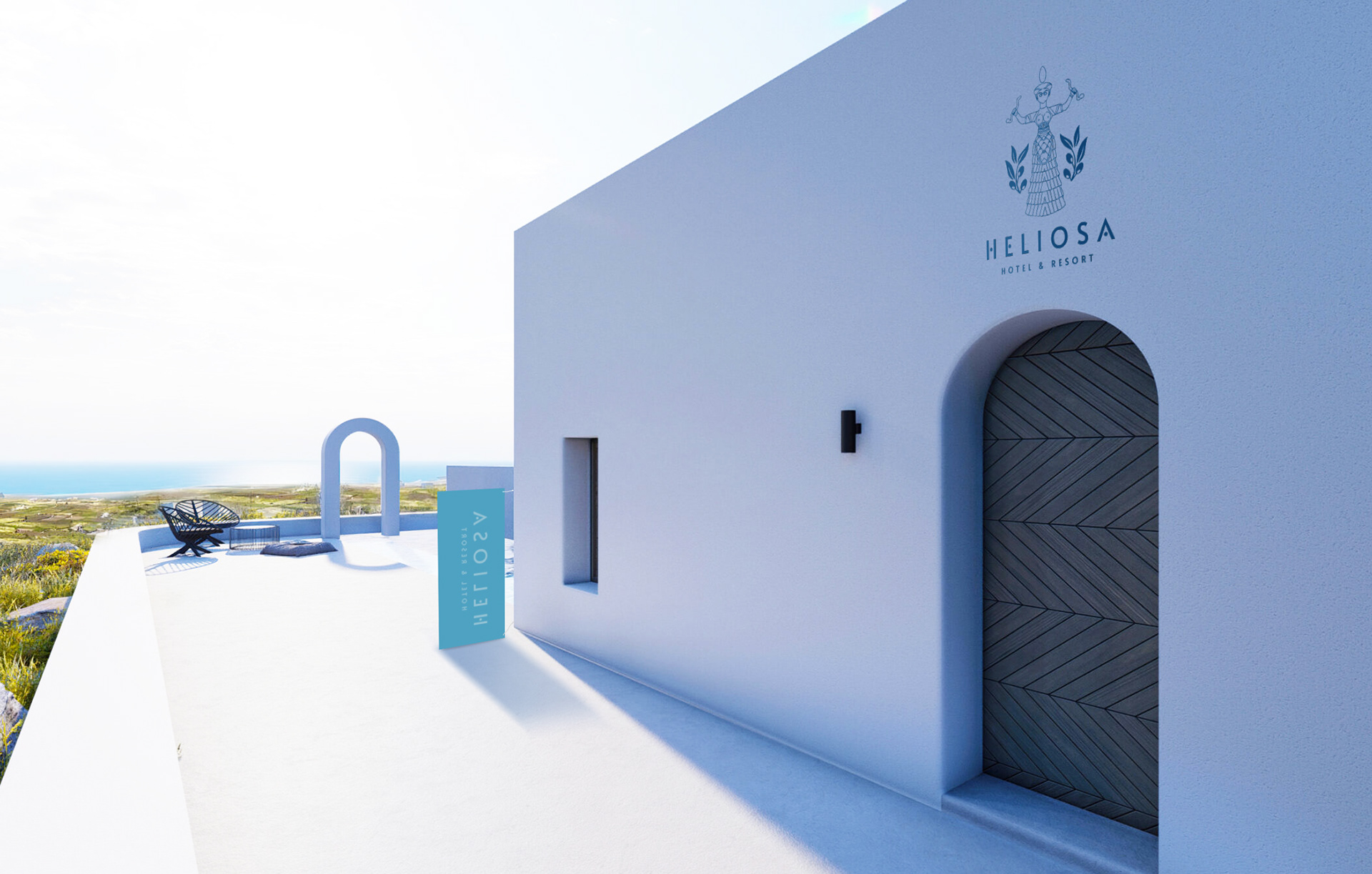
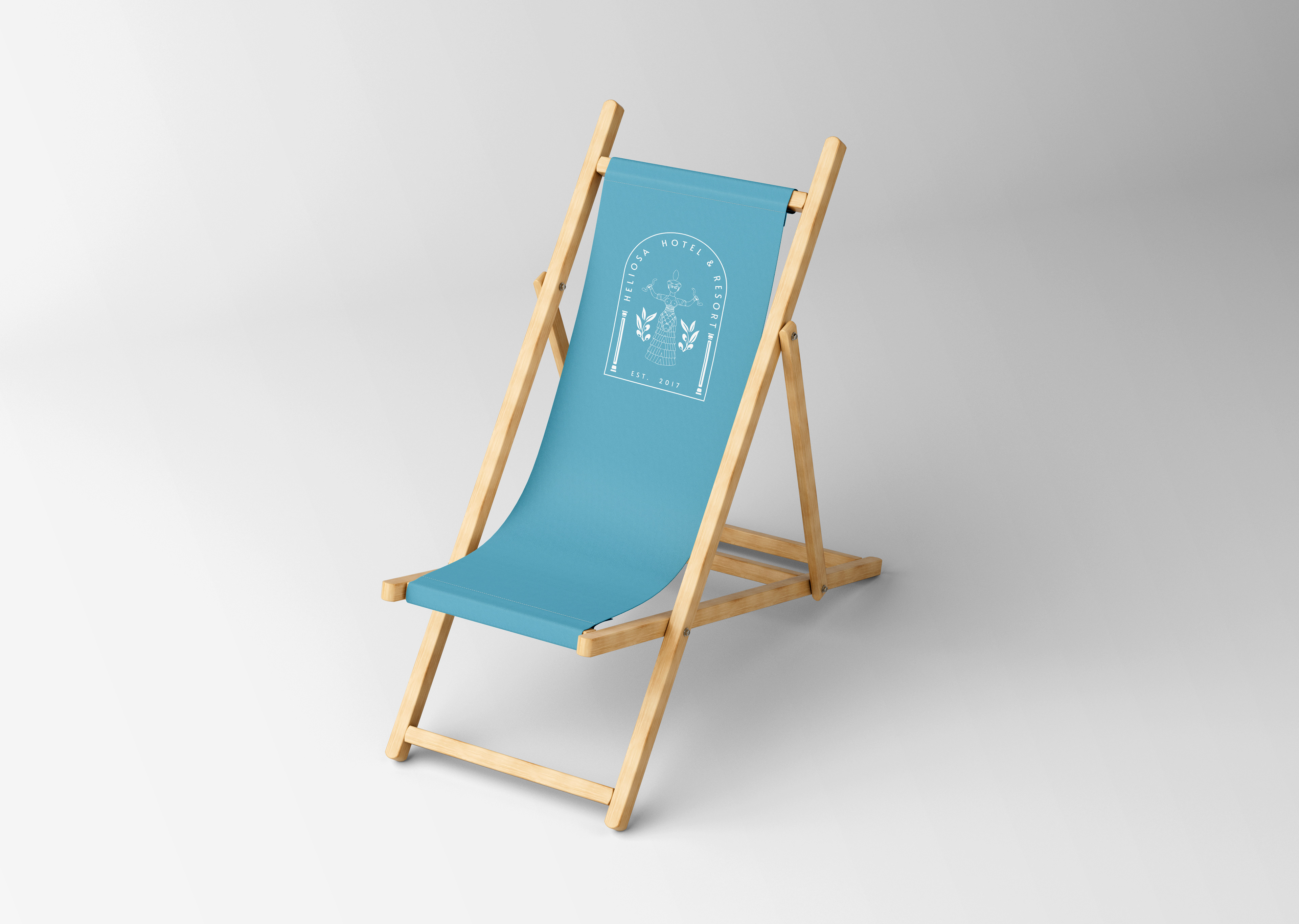

Continuing the vision of Heliosa, the challenge in this project was to find the perfect balance between ancient Minoan symbolism and modern design elements. The task was to honor the rich cultural history of Crete while creating a visual identity that felt contemporary and luxurious.
We worked closely with the hotel’s ethos, ensuring that every detail, from the logo to the color palette, conveyed a sense of timeless elegance without overwhelming the senses. One of the key challenges was capturing the essence of the Snake Goddess, her symbolism of protection and renewal—while keeping the design sophisticated and inviting for a modern audience.
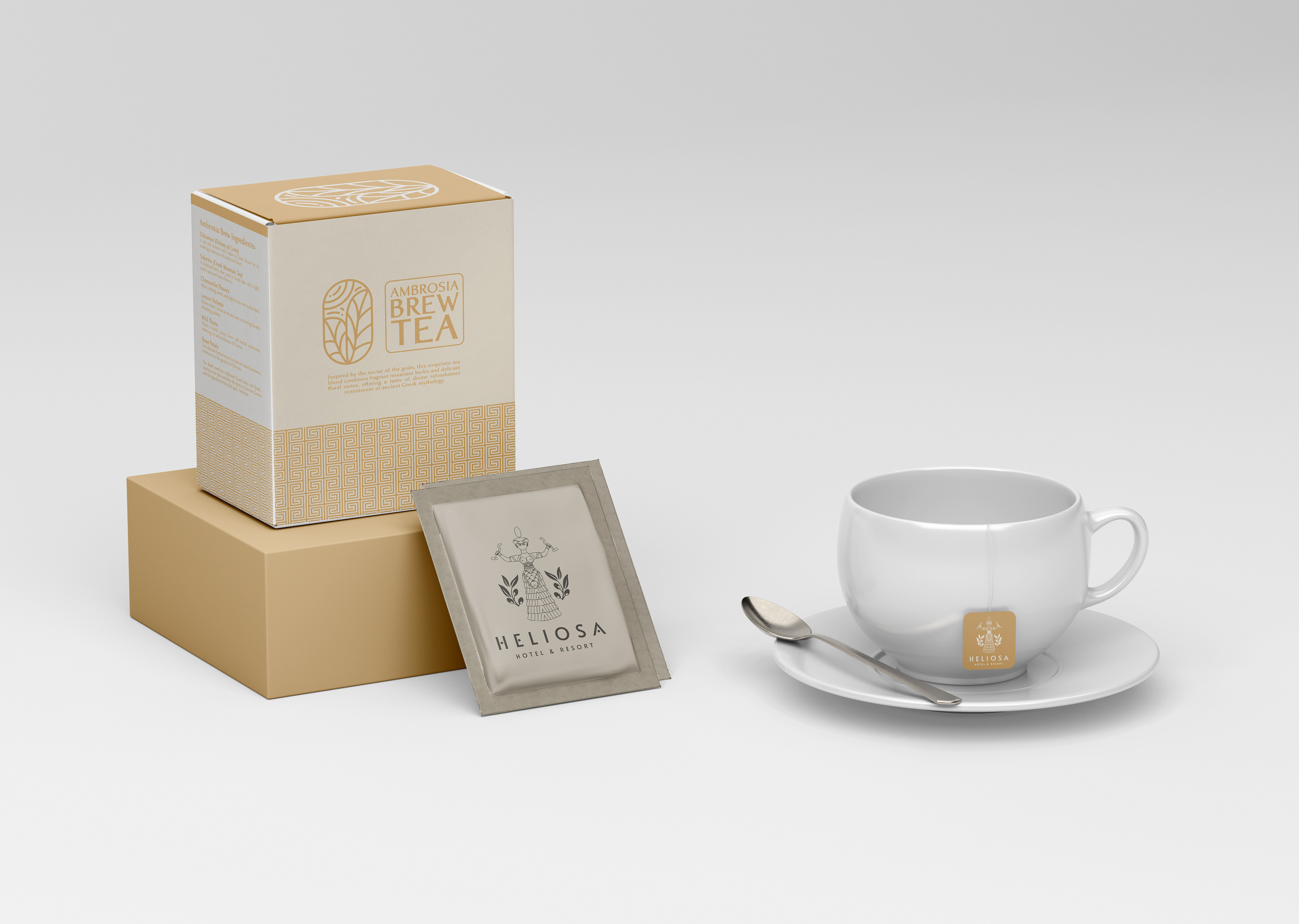
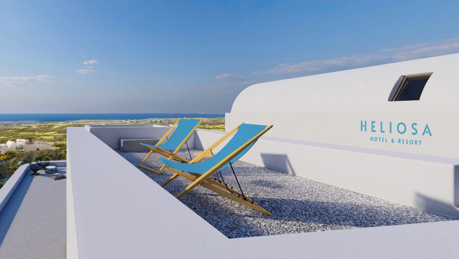
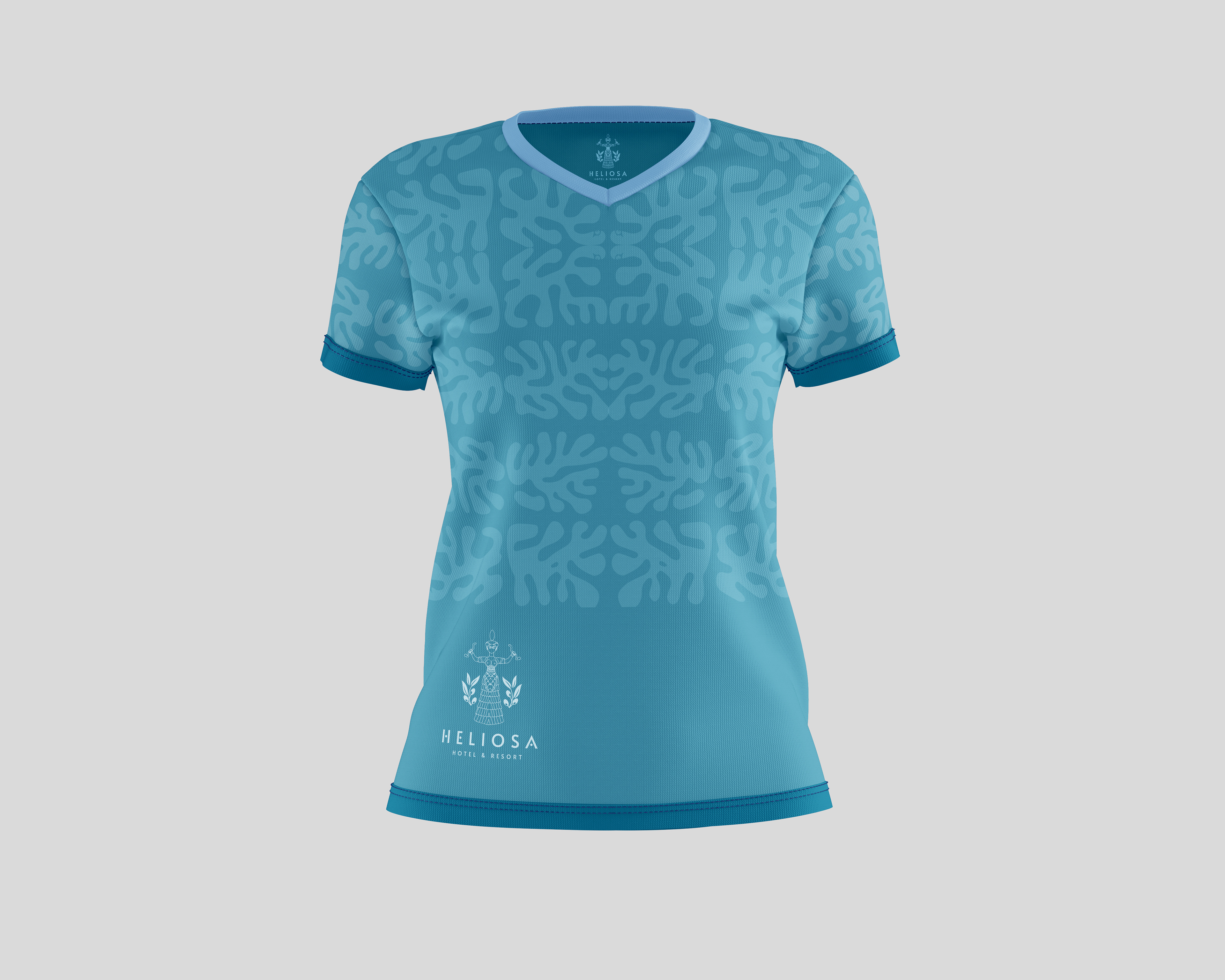
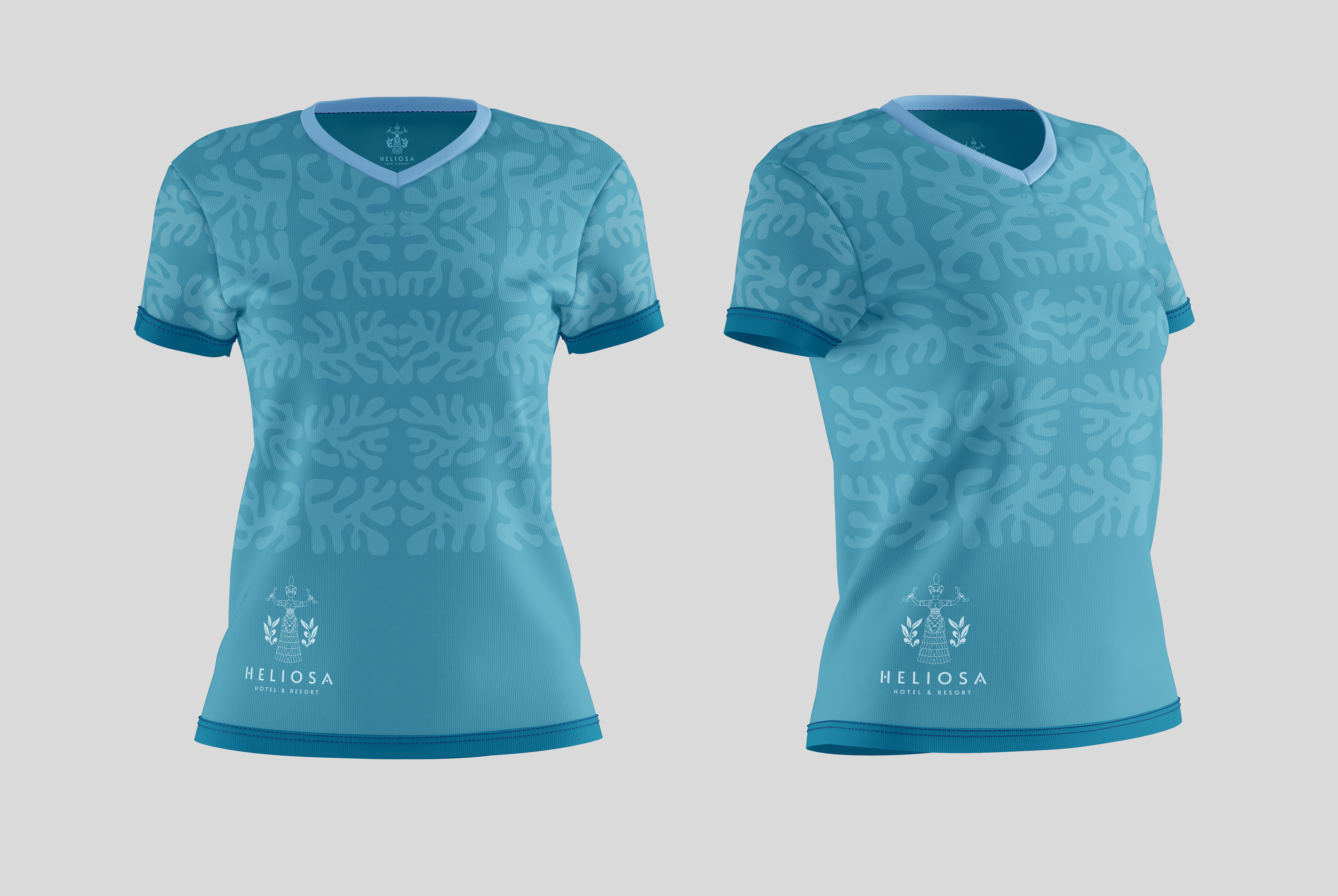
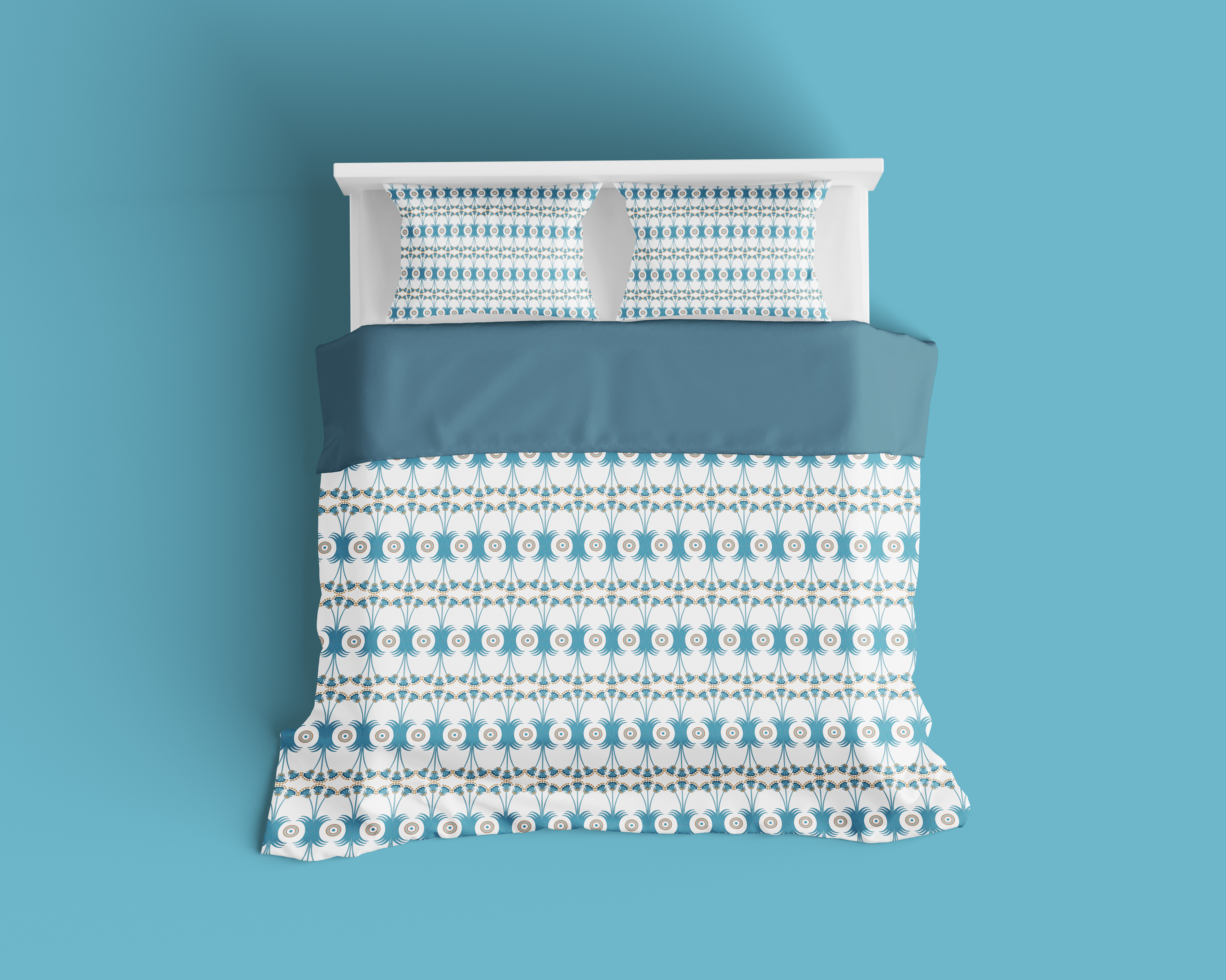
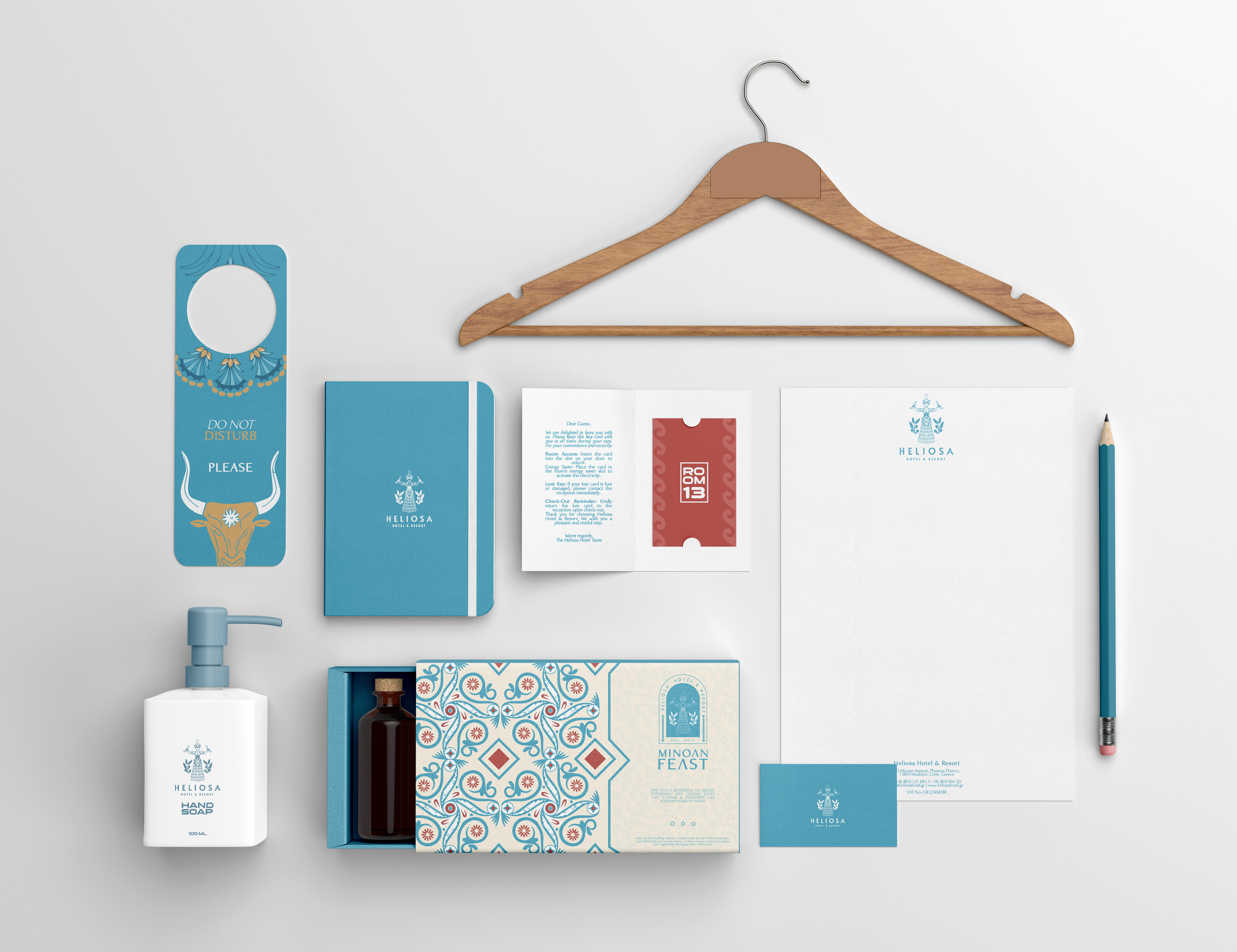
Additionally, sourcing the right materials and textures that would evoke both ancient and luxurious qualities required careful consideration. The earthy tones and Minoan crimson had to be subtle yet impactful, ensuring they resonated with the rich history of the island while also fitting seamlessly into the hotel’s modern aesthetic.
Overall, it was about creating a cohesive narrative through visual design that would immerse guests in an experience of serenity and history, without compromising on the high standards of luxury they expect. The result is a visual identity that speaks to the past, yet feels undeniably of the present.

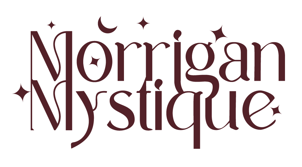
The chosen logo for Isariel Cosmetics reflects a deep connection to both elegance and mystique. The naming draws inspiration from the Irish goddess Morrigan, known as a powerful symbol of beauty, transformation, and strength. As a beauty emissary, Morrigan embodies the essence of empowerment, making her an ideal representation of the brand.
The use of the word "mystique" adds a layer of intrigue and sophistication, creating a contrast that elevates the brand’s identity. The design and color palette were carefully selected to instill a sense of trust and safety, ensuring that clients feel they are investing in the finest, most meticulously crafted cosmetic products available.
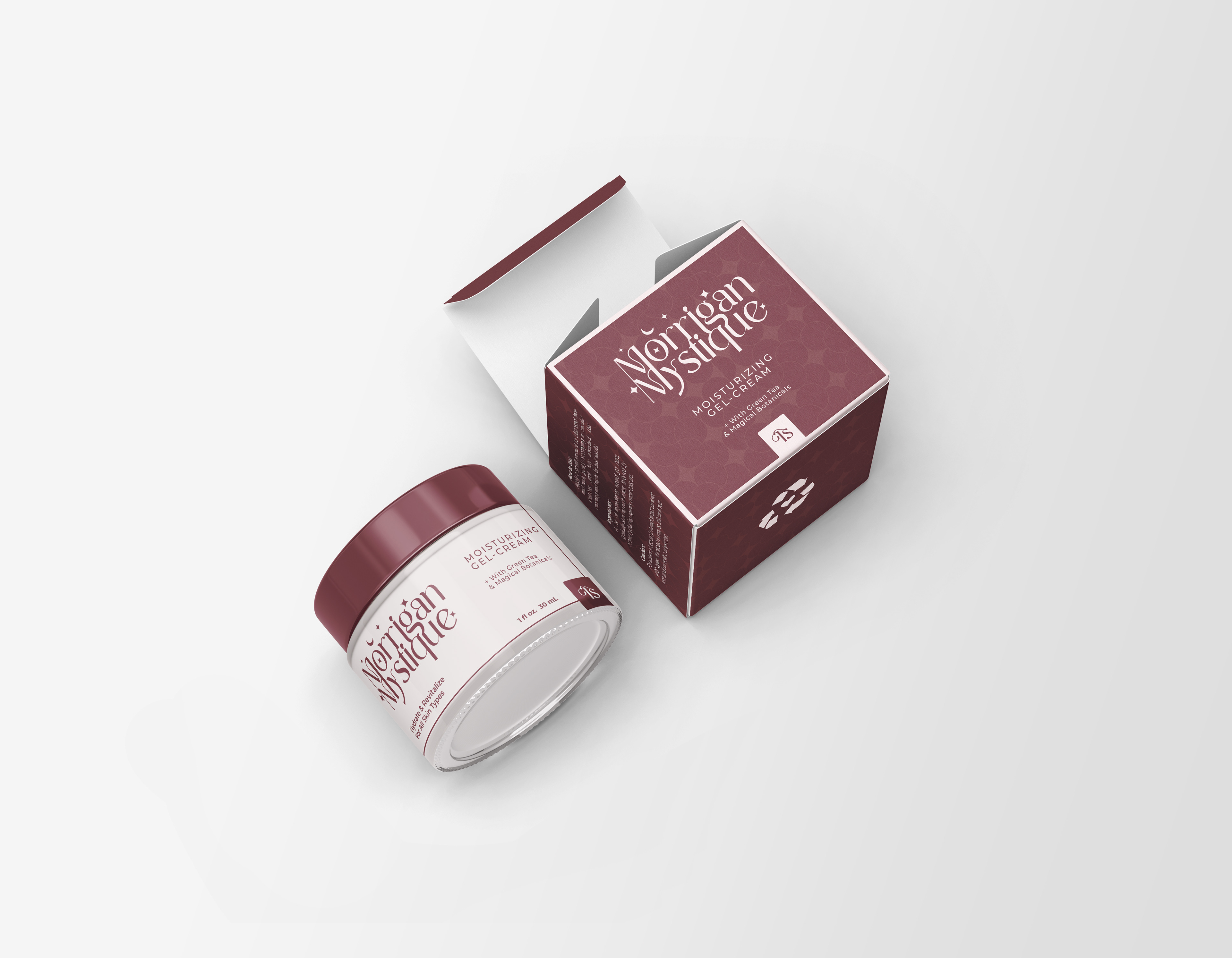

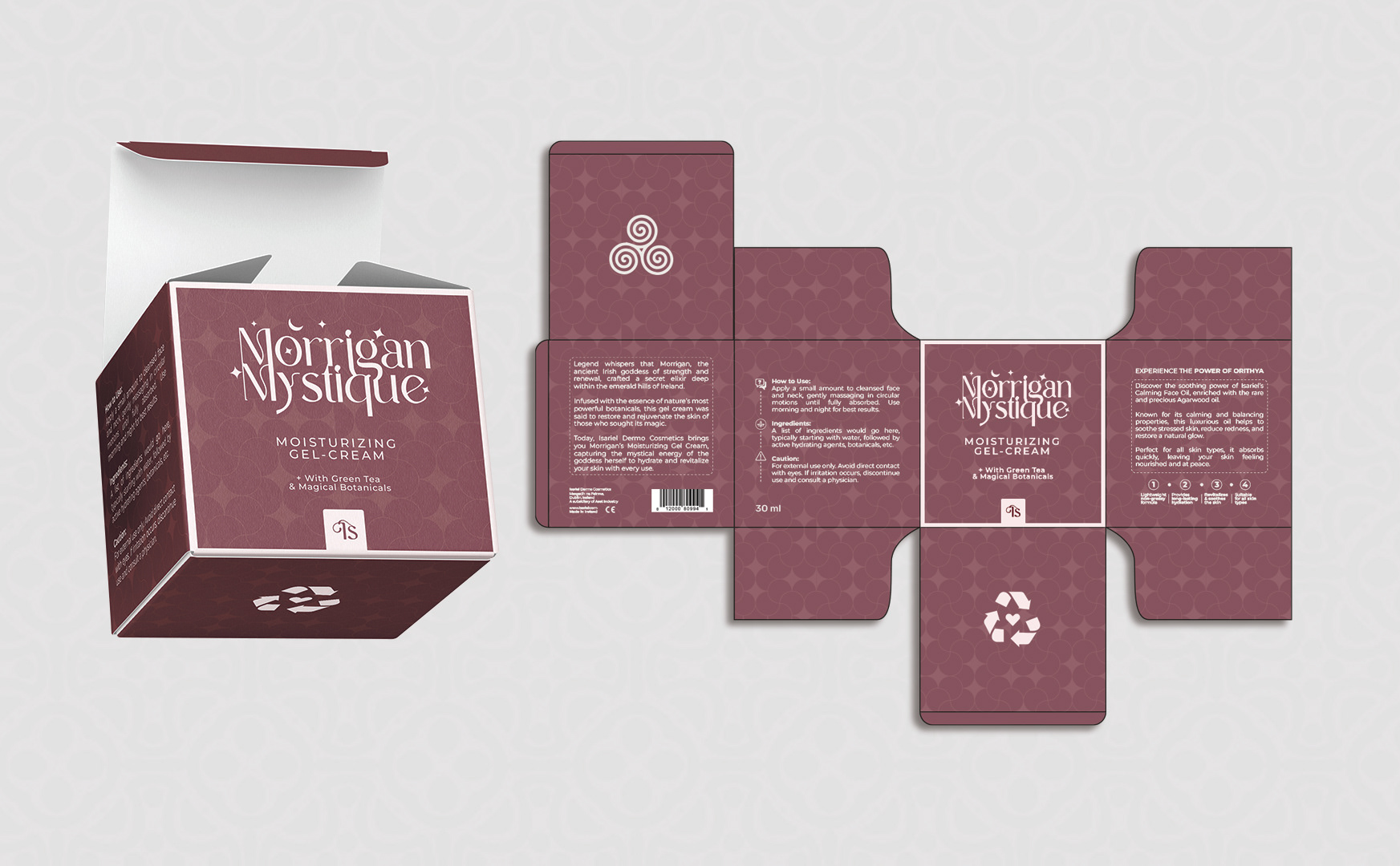
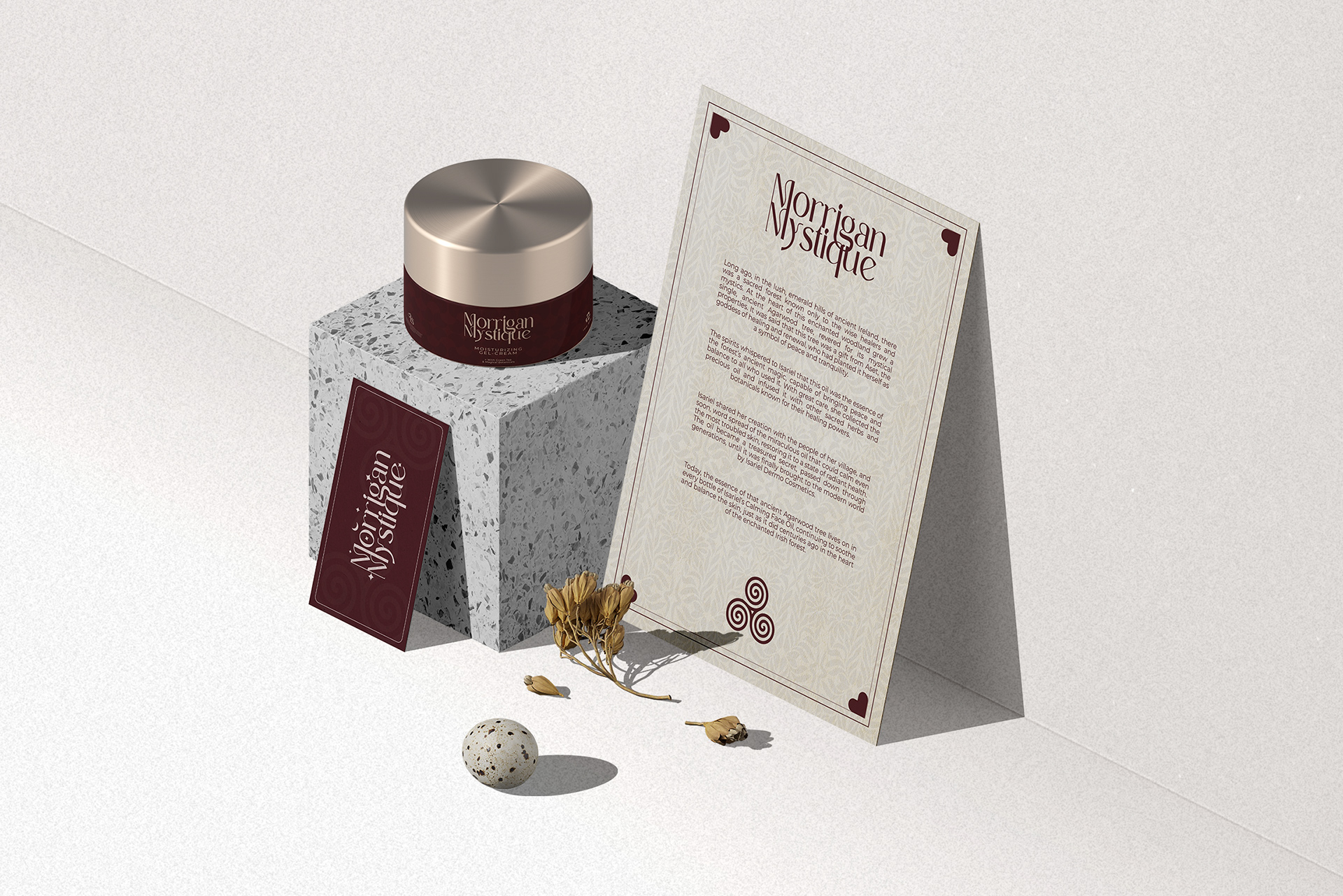
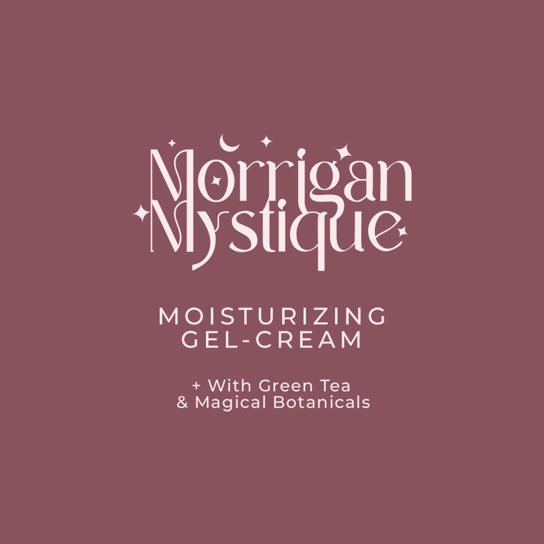
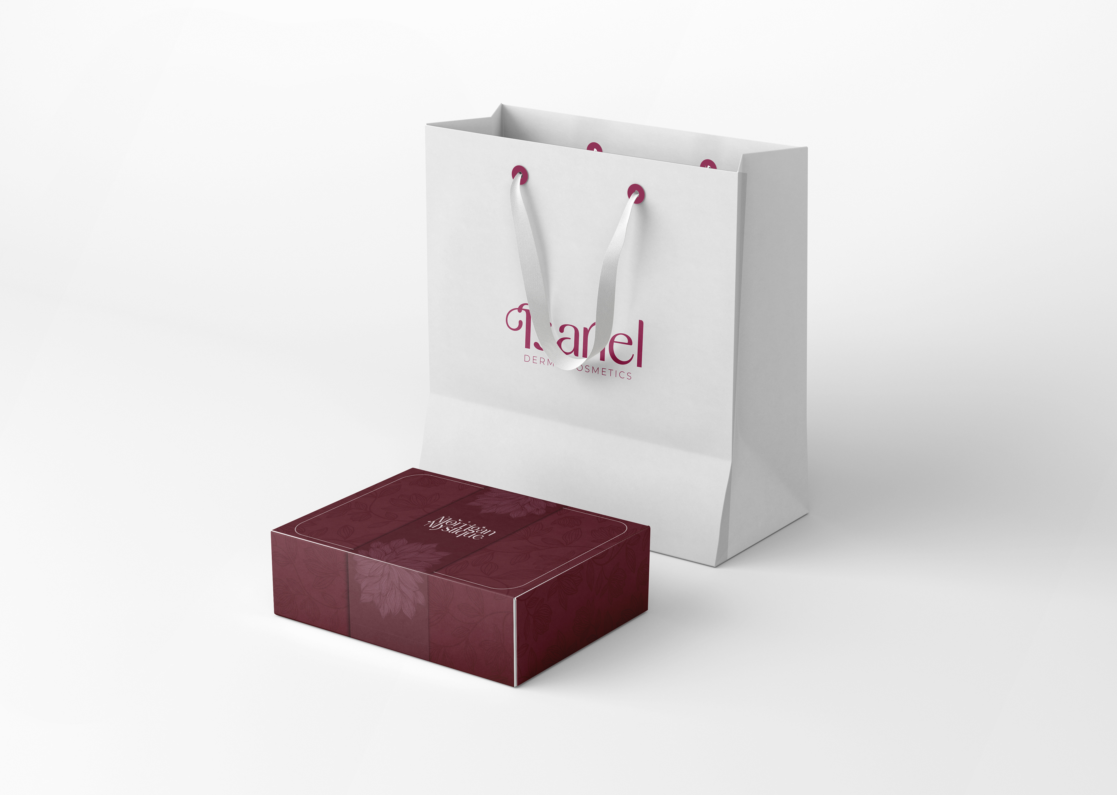
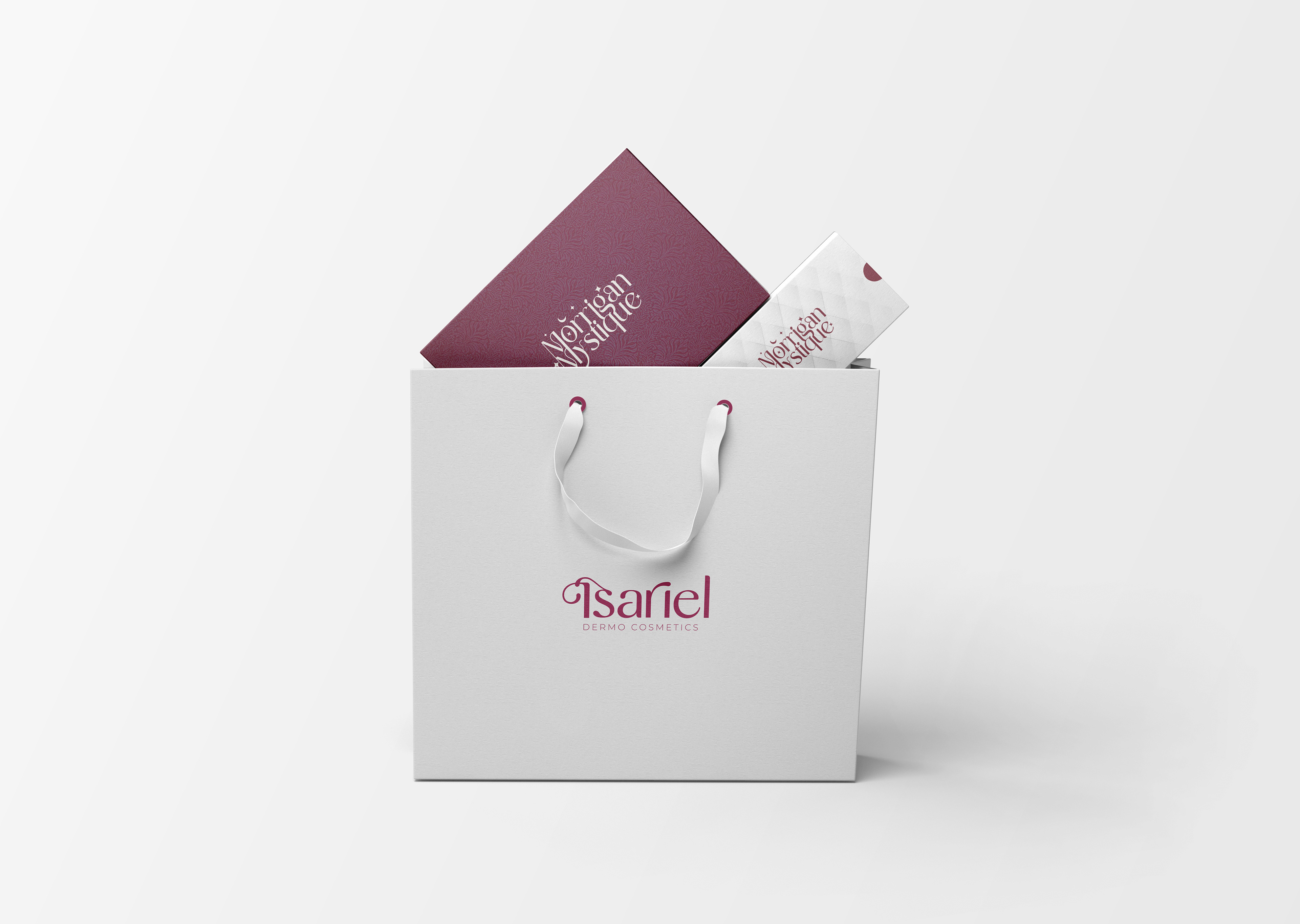
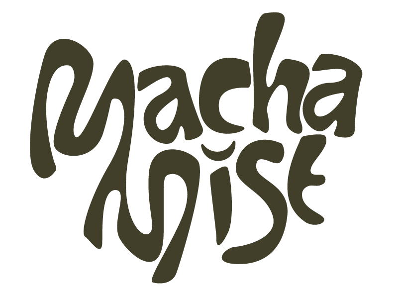
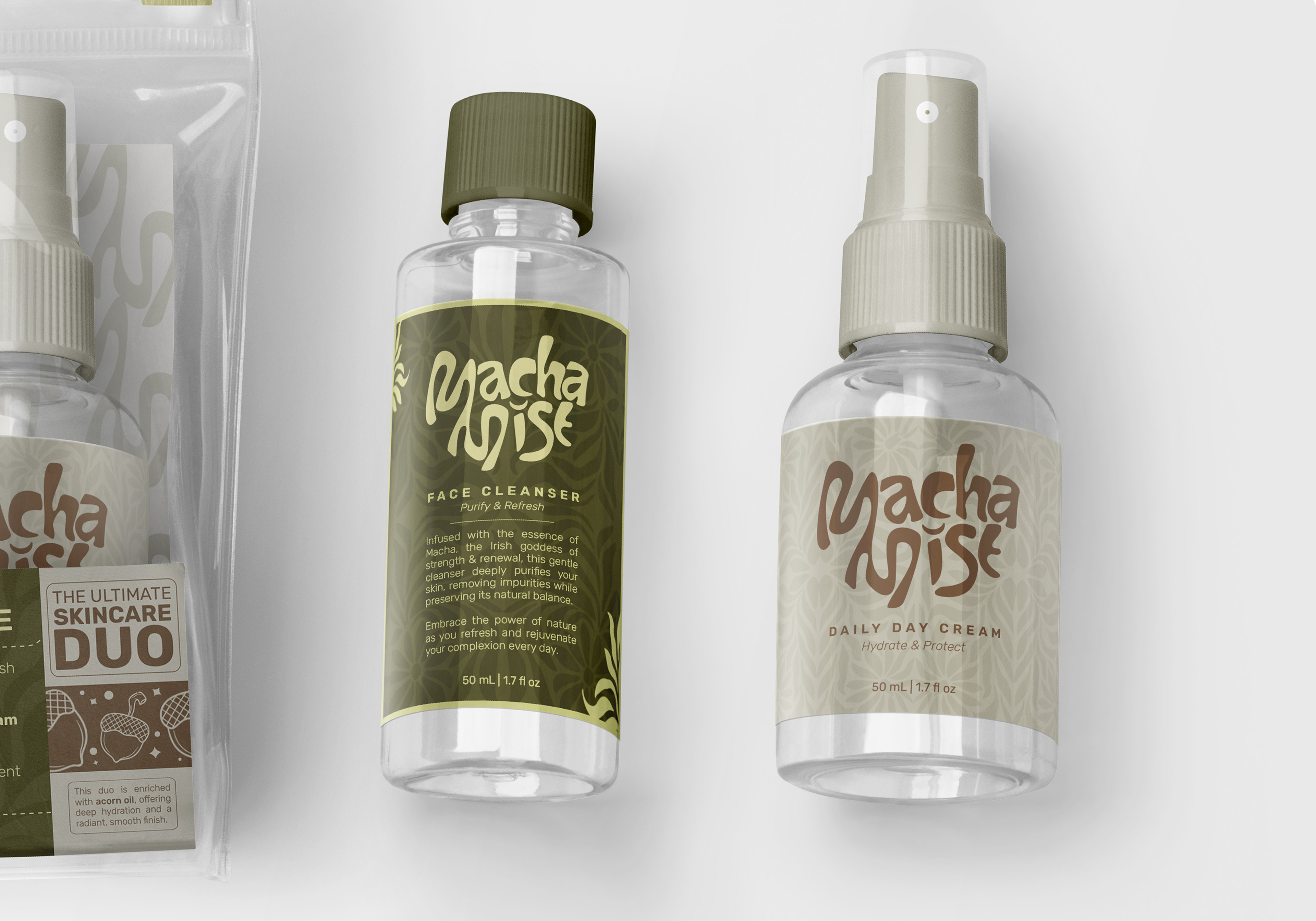
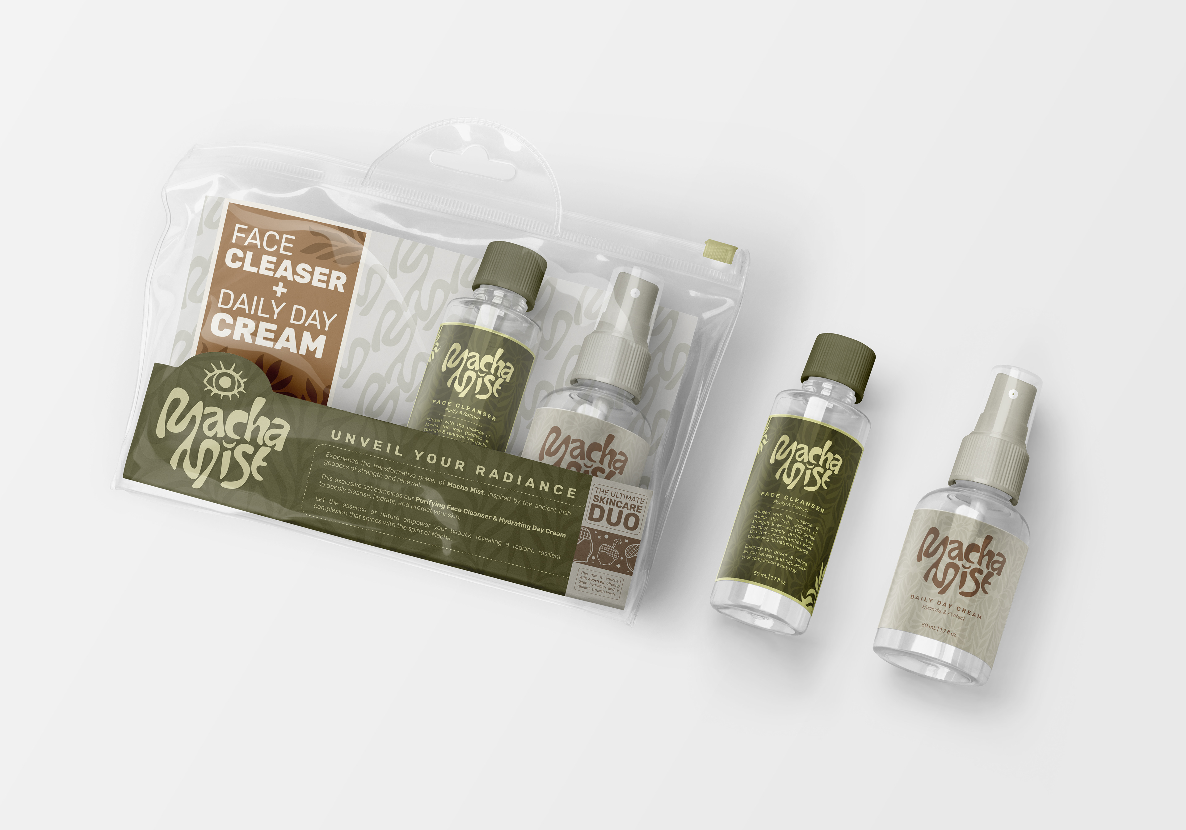
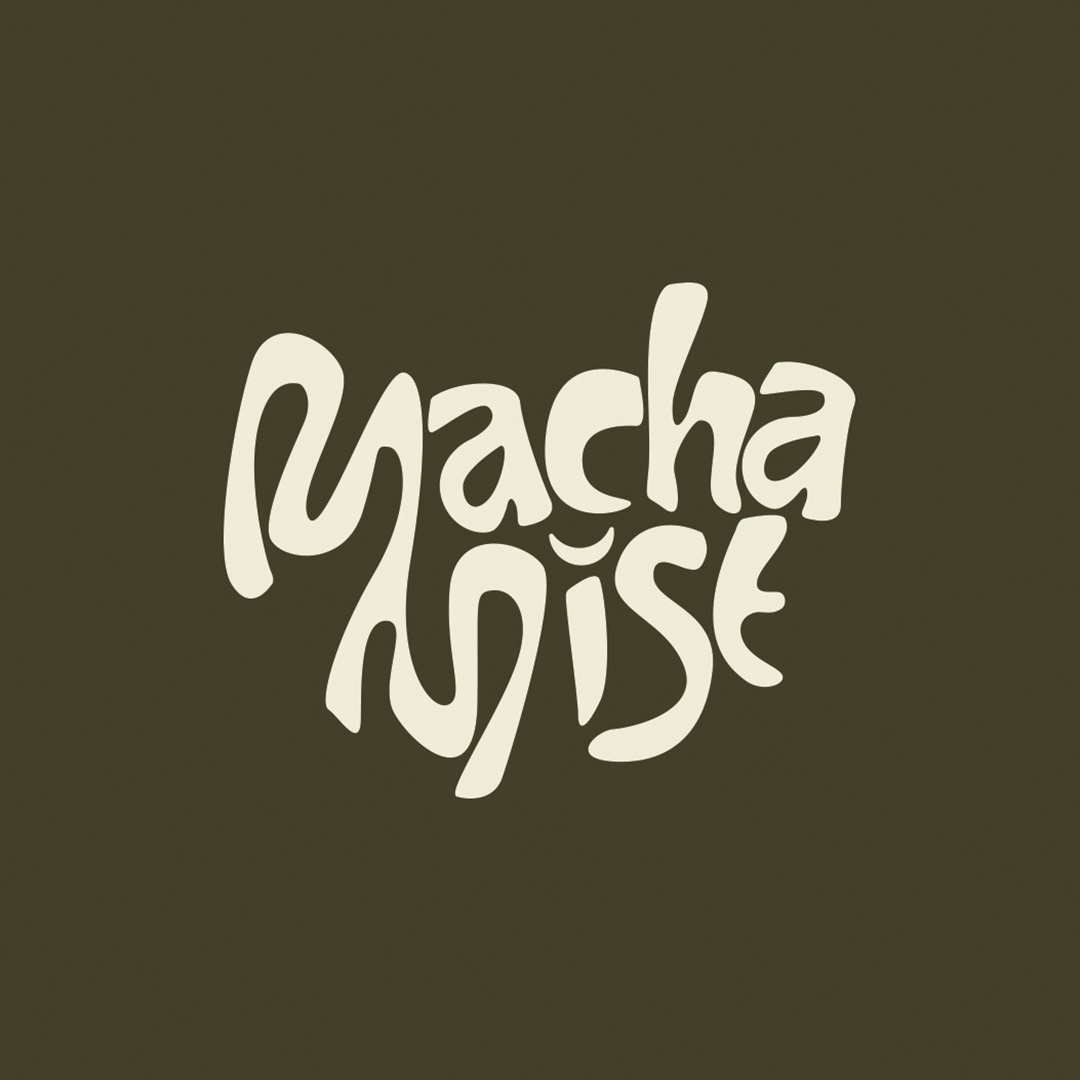
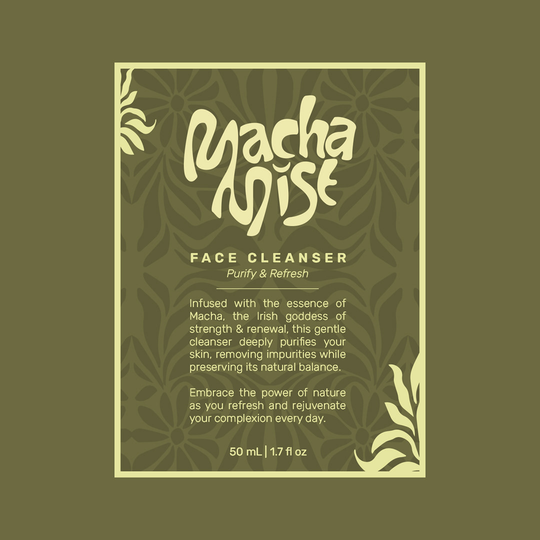
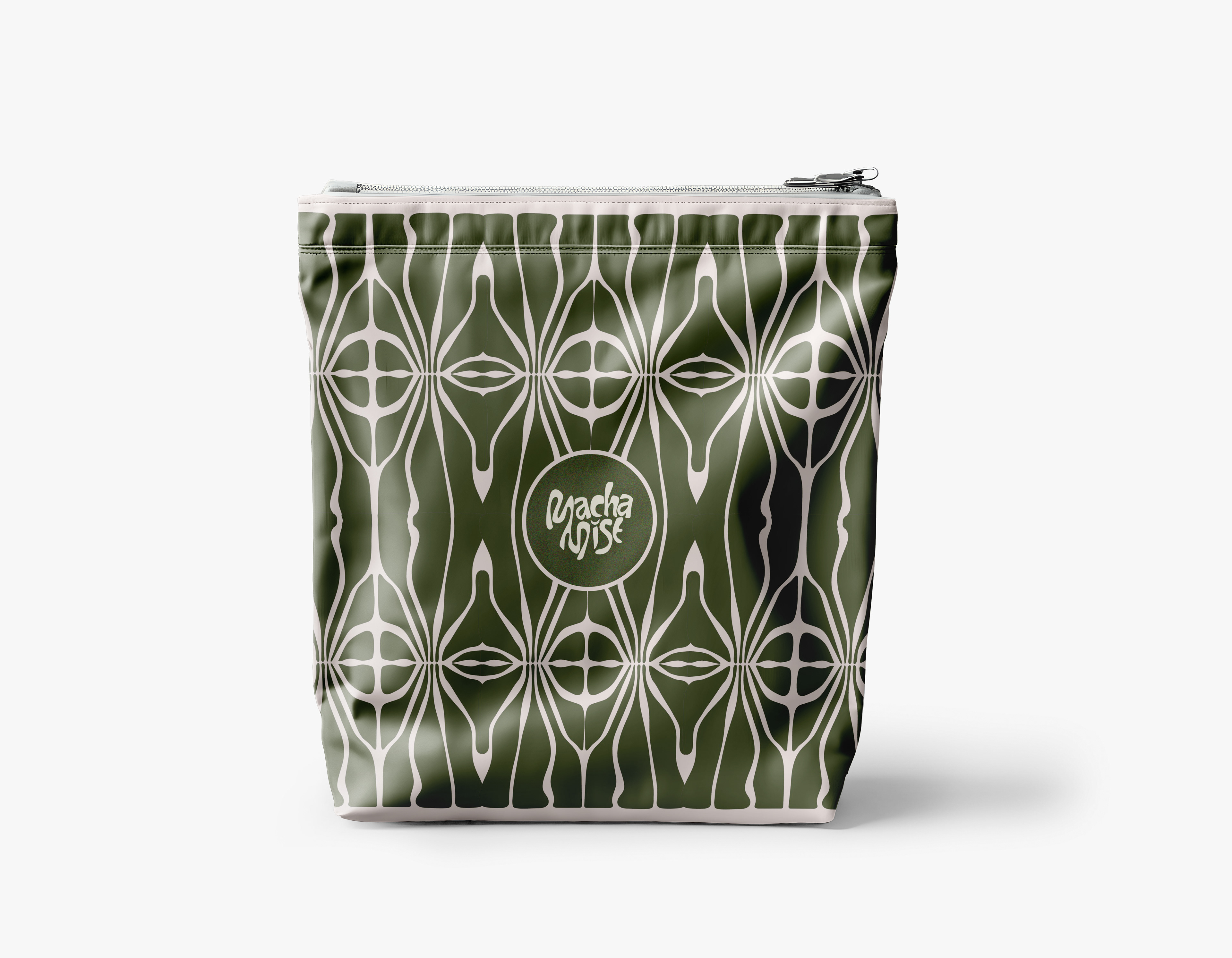
The selected logo is a distinctive embodiment of elegance and deep symbolism. Inspired by the Irish goddess Macha, known for her strength, beauty, and sovereignty, the logo positions her as an ideal emissary of beauty. Macha's association with femininity and power makes her a perfect symbol to represent our brand's commitment to empowering women. The incorporation of the word "mystique" adds an intriguing contrast, enhancing the allure and depth of the brand's identity.
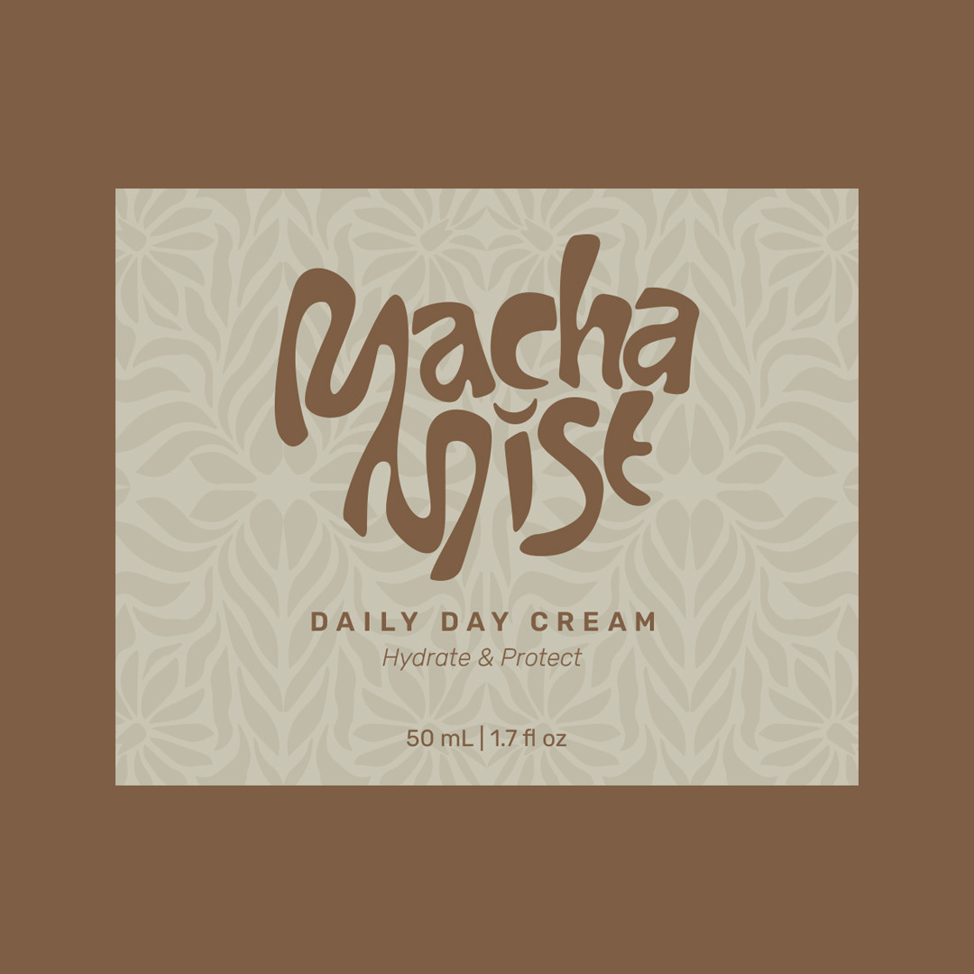
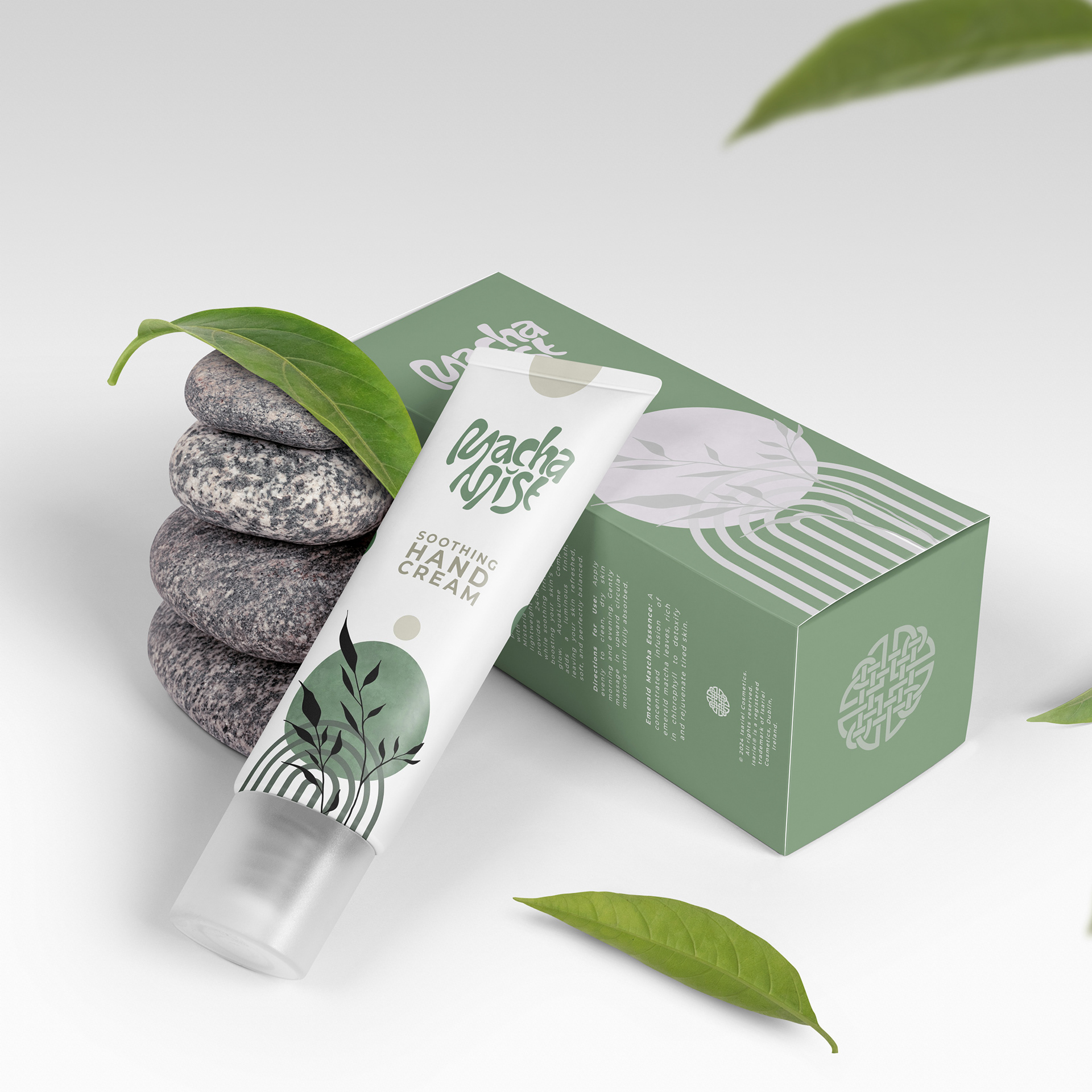
The design, colors, and naming were meticulously crafted to make clients feel safe and confident that they are purchasing the finest and most precise cosmetic products. The duo pack features a 50ml face cleanser and a 50ml daily day cream, both enriched with acorn extract. The chosen color palette reflects the natural essence of the products, symbolizing the purity of oil, acorn, and other botanical wonders. These earthy tones emphasize the natural ingredients and the botanical magic infused in each product.
This logo differs from previous designs, showcasing the company's expansive spirit and its limitless commitment to noble and aesthetic excellence. The unique blend of ancient symbolism and modern design principles highlights our dedication to creating products that transcend traditional boundaries. Suitable for women of all ages, this product line bridges timeless beauty with contemporary elegance, allowing every woman to feel connected to something both ancestral and exquisitely refined.




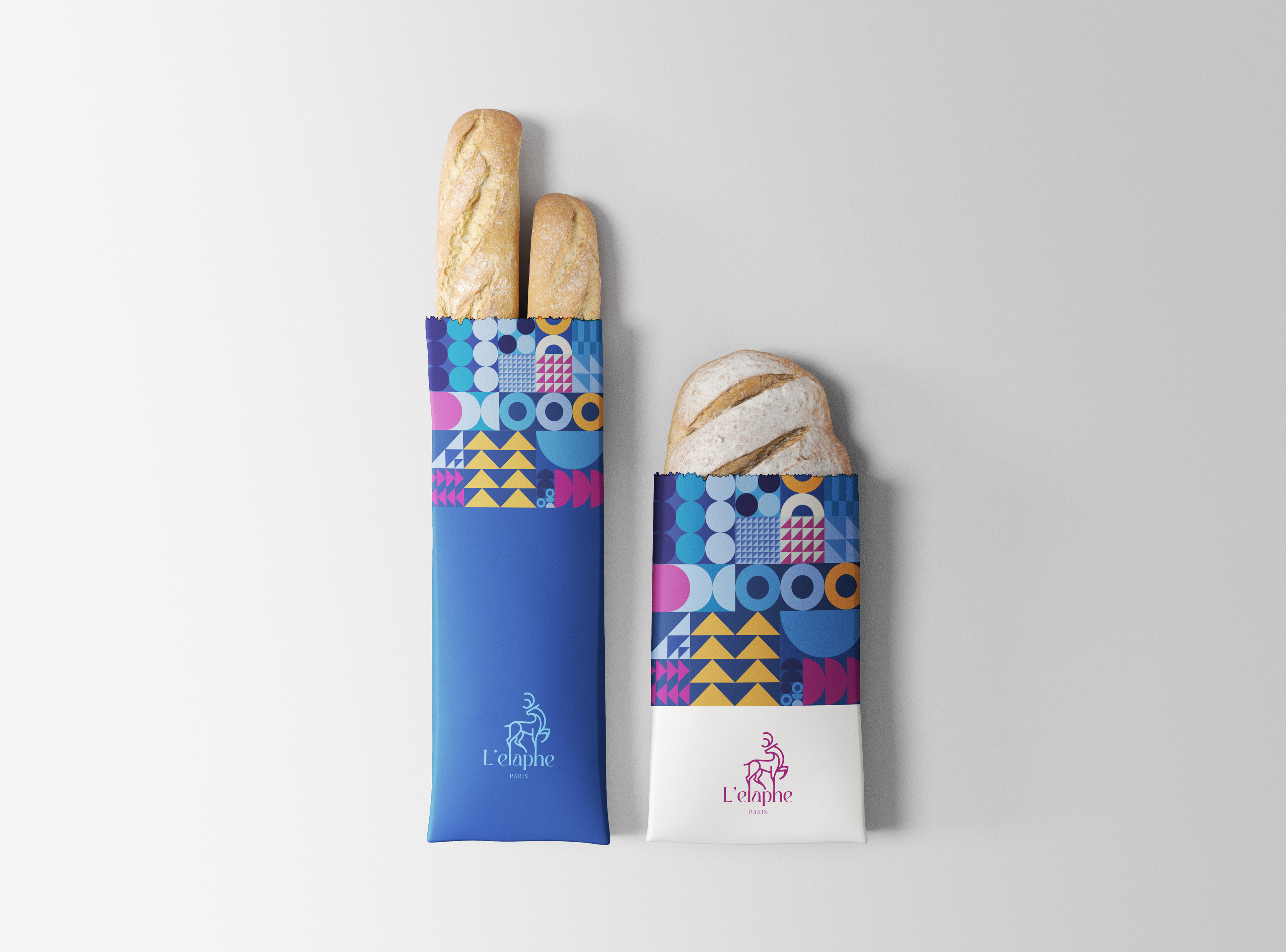
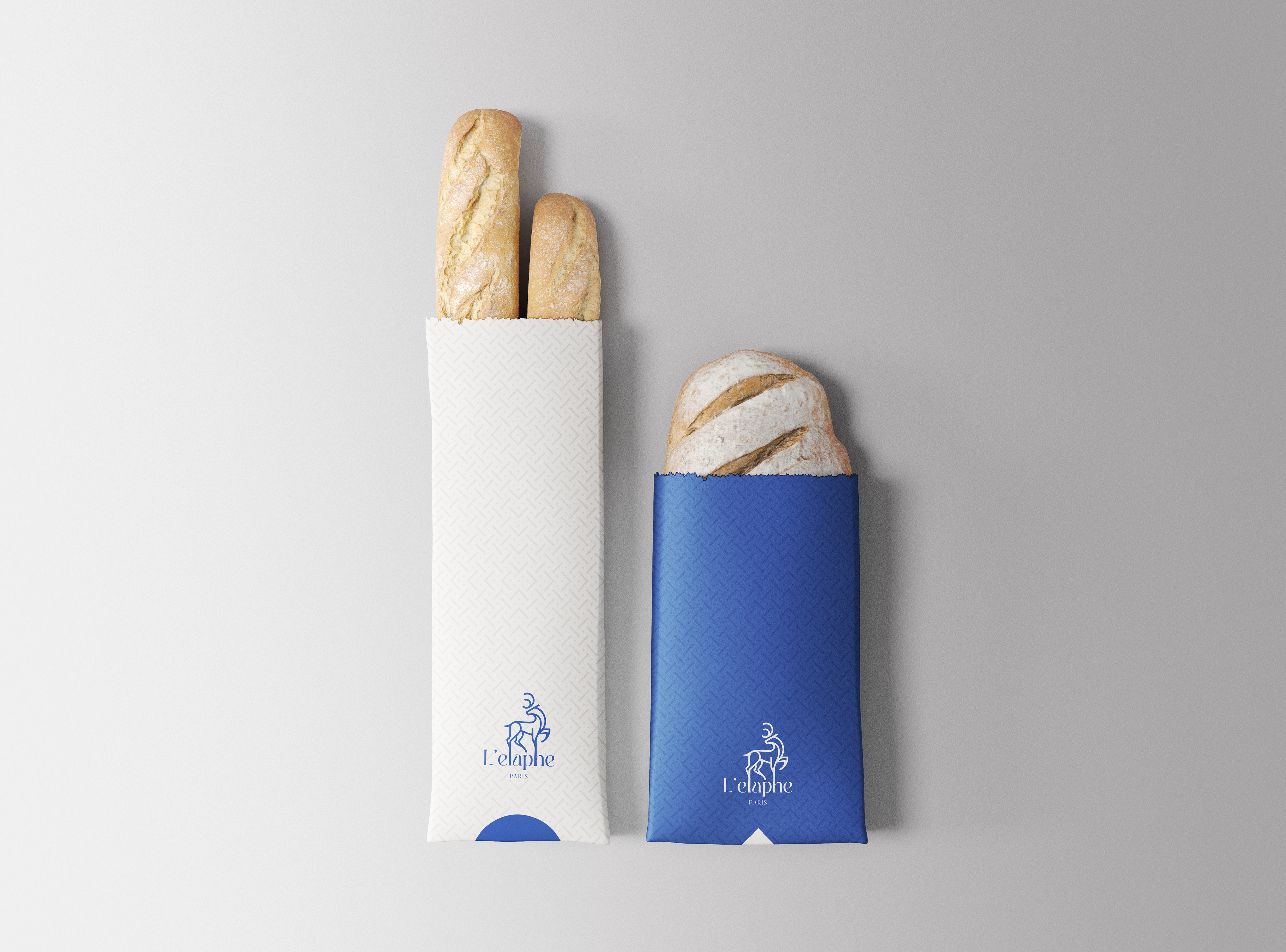
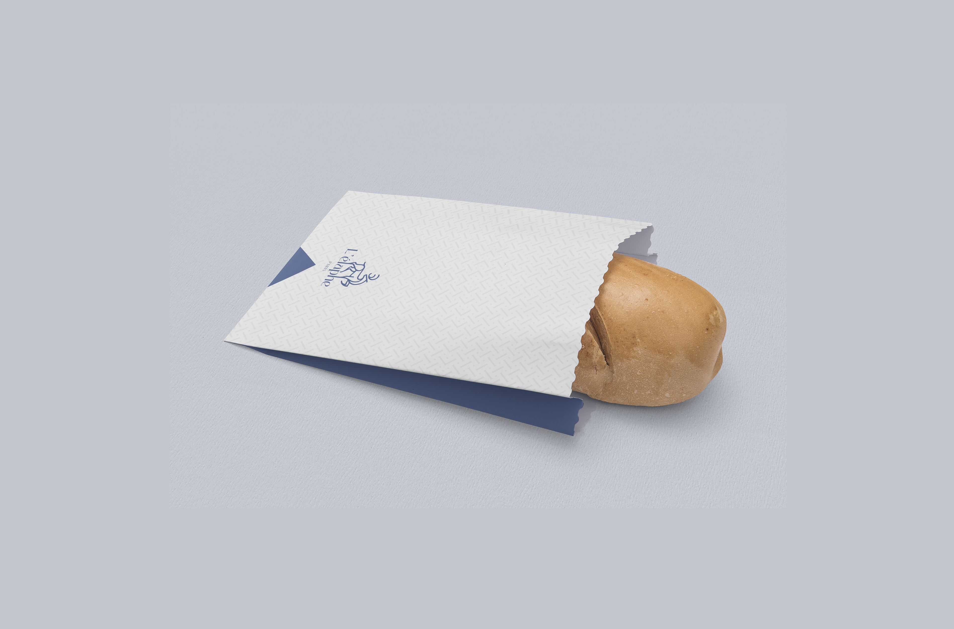
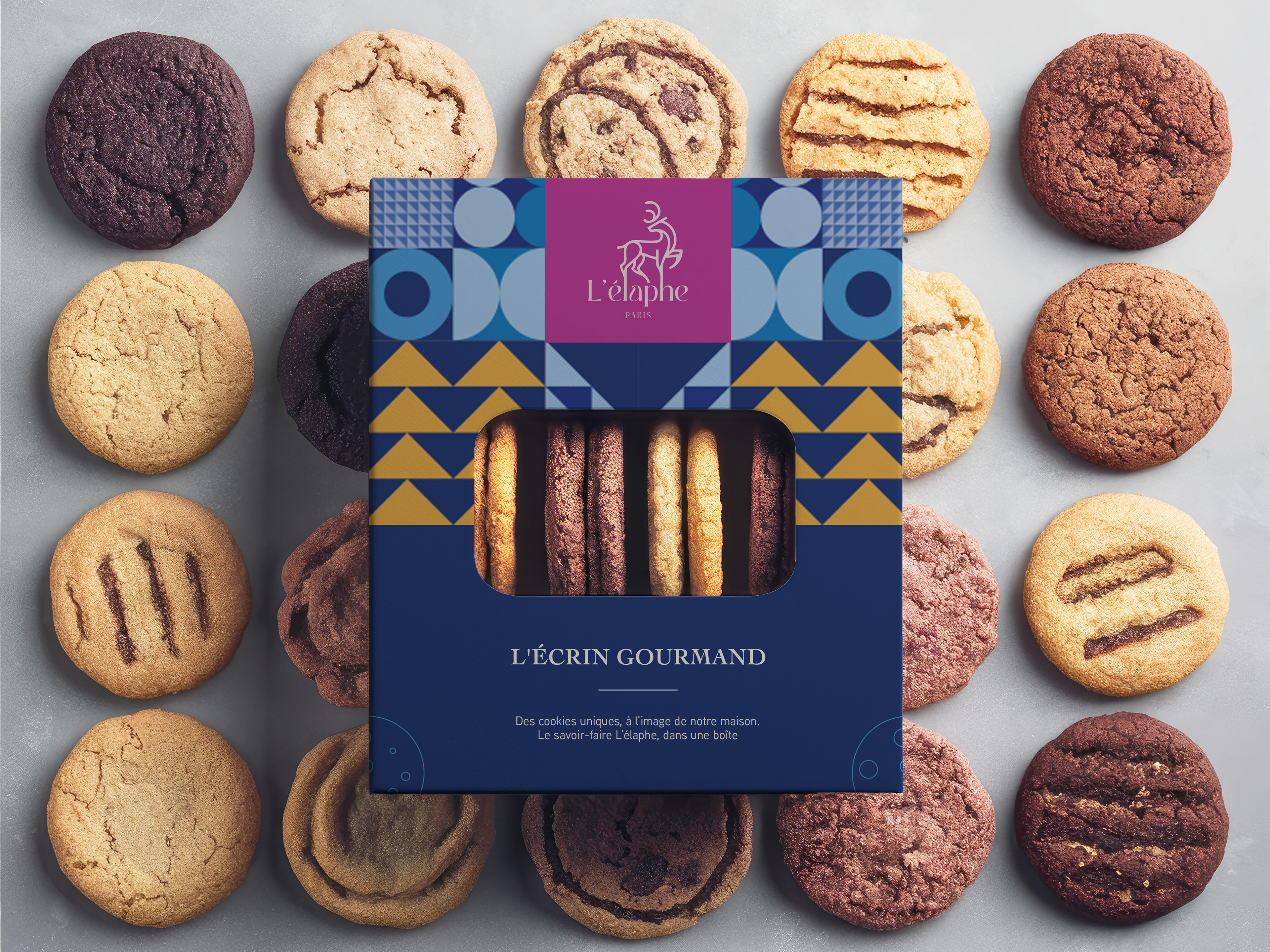
L'élaphe is a luxury French patisserie in the heart of Paris, where tradition seamlessly meets modernity. In French, "l'élaphe" refers to a type of deer, specifically the red deer (Cervus elaphus). Our brand embodies a fusion of the old and the new, a contemporary reimagining of classic elegance, making refined indulgence accessible to all, without boundaries or social distinctions. After all, perhaps that's the best way to avoid a second French Revolution!
Rooted in "French Blue," symbolizing the sky, beauty, and dreams, our color palette celebrates harmony, diversity, and the core values of the French Republic. We offer a curated selection of products with unique designs and varied price points, ensuring there's something exquisite for everyone.
Our mission is to craft creations that are as visually captivating as they are delicious, perfectly complementing the refined flavors our pastry artisans bring to life each day, a true balance of beauty and taste.
L'élaphe symboliquement
In a symbolic sense, “l’élaphe,” or the red deer, represents nobility, abundance, and the harmonious relationship between nature and craft—qualities also treasured in the world of French bakery and pastry. The red deer, an animal revered in French culture and often associated with the mythic wilds of the Ardennes and Vosges forests, embodies an ancient connection to the land and seasons. Just as the red deer lives off the land’s gifts, a French boulanger or pâtissier draws from nature’s bounty to create artisanal bread and delicate pastries that nourish and delight. Historically, the red deer was seen as a royal and mystical creature, even appearing in the coat of arms and legends from the Middle Ages. This symbolism aligns with the traditional baker’s role in French communities: a respected artisan whose craft is woven deeply into the cultural fabric, bringing warmth, sustenance, and a touch of everyday magic to people’s lives.
Why Blue and not Red ?
This choice has nothing to do with the Matrix metaphor of the blue and red pills, the client wasn't Neo nor Morpheus. The client selected blue for his brand to evoke calm, trust, and sophistication, qualities that reflect our vision of refined craftsmanship and elegance. While l'élaphe is known as the red deer, symbolizing vitality and strength, blue offers a modern interpretation of tradition, softening the red deer’s energy to create a more serene, welcoming atmosphere. Blue also resonates with the French cultural landscape, evoking images of clear skies and the waters that frame France’s natural beauty. By combining the symbol of l'élaphe with blue, we unite the strength and nobility of the deer with a tranquil, timeless aesthetic, perfectly capturing the spirit of a French bakery and pastry shop that respects tradition while embracing contemporary charm.